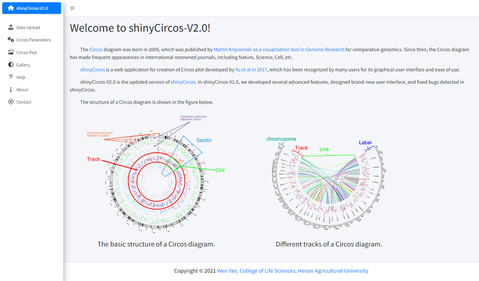
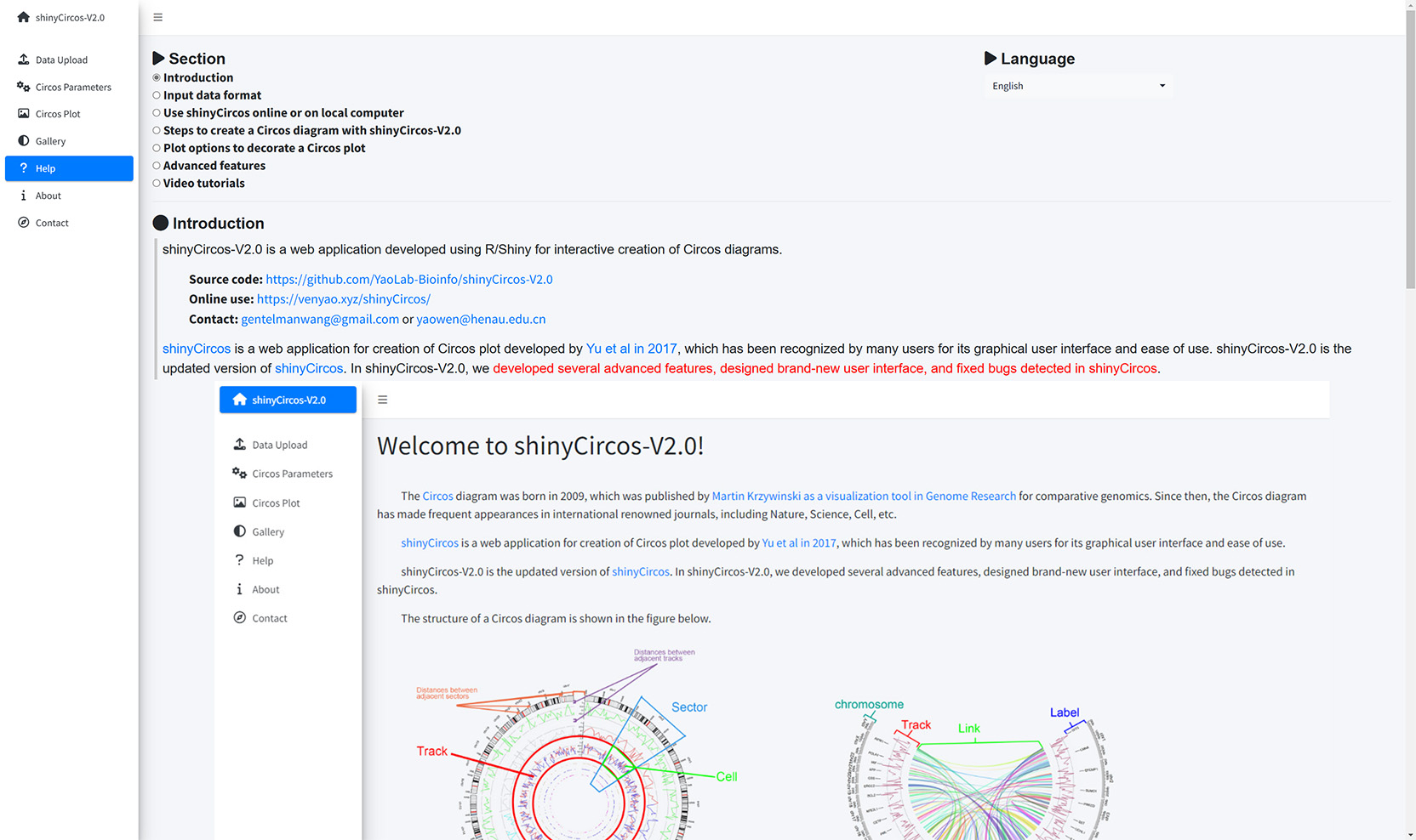
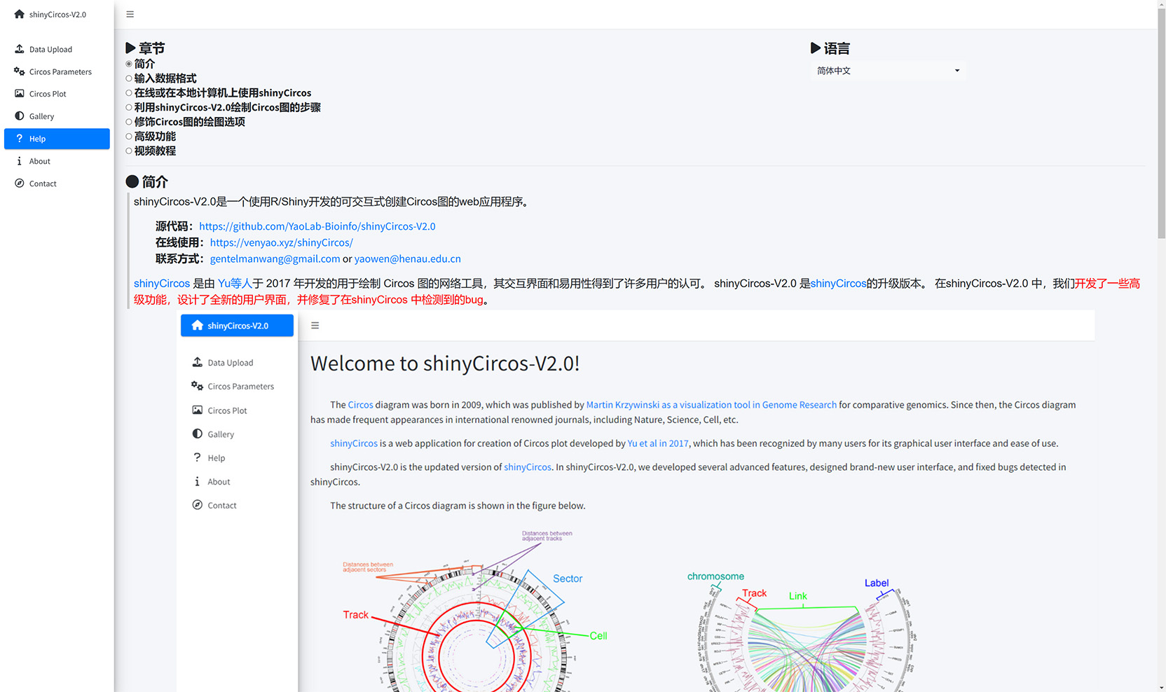
Welcome to shinyCircos-V2.0!
- The Circos diagram was born in 2009, which was published by Martin Krzywinski as a visualization tool in Genome Research for comparative genomics.
- The Circos diagram has made frequent appearances in international renowned journals, including Nature, Science, Cell, etc.
- shinyCircos is a web application for creation of Circos plot developed by Yu et al in 2017, which has been recognized by many users for its graphical user interface and ease of use.
- shinyCircos-V2.0 is the updated version of shinyCircos. In shinyCircos-V2.0, we developed several advanced features, designed brand-new user interface, and fixed bugs detected in shinyCircos.
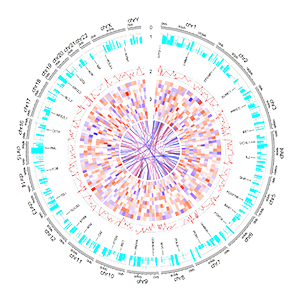
- : Wang et al. iMeta. 2023
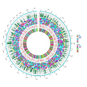
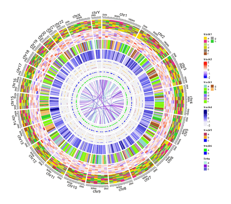
- The structure of a Circos diagram is shown in the figure below.
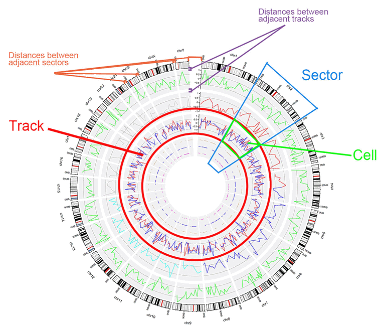
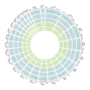
The basic structure of a Circos diagram.
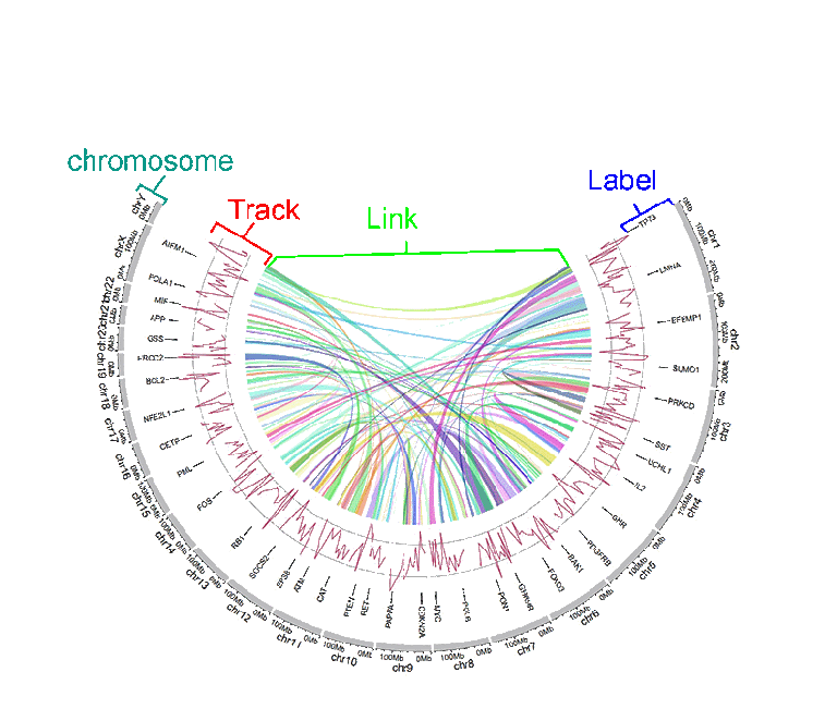
Different tracks of a Circos diagram.
Step 2. Choose an example dataset: |
Different parameters were pre-setted for different example datasets, which can not be adjusted. |
Chromosome data (used to define the chromosomes of a Circos plot)
File name |
Name of the uploaded file. |
Chromosome data type |
Chromosomes data can be either general data with 3 columns or cytoband data with 5 columns. The first 3 columns of either type of data should be the chromosome ID, the start and end coordinates of different genomic regions. See example data for more details. |
Section
章节
Language
语言
Introduction
shinyCircos-V2.0 is a web application developed using R/Shiny for interactive creation of Circos diagrams.
Source code: https://github.com/YaoLab-Bioinfo/shinyCircos-V2.0
Online use: https://venyao.xyz/shinyCircos/
Contact: gentelmanwang@gmail.com or yaowen@henau.edu.cnshinyCircos is a web application for creation of Circos plot developed by Yu et al in 2017, which has been recognized by many users for its graphical user interface and ease of use. shinyCircos-V2.0 is the updated version of shinyCircos. In shinyCircos-V2.0, we developed several advanced features, designed brand-new user interface, and fixed bugs detected in shinyCircos.
Before using shinyCircos-V2.0, we need to understand the structure of a typical Circos plot. Please check the names of each component of a typical Circos plot, which will help you go through this manual.
The basic structure of a Circos diagram.
Different tracks of a Circos diagram.
Input data format
To use shinyCircos-V2.0, input datasets must be prepared in correct format.
We recommend uploading the input file in ".csv" format, as ".csv" files are explicit and commonly used in data storage and analysis. Please note that proper names and orders of columns are critical for the input data.
1 Chromosome data (used to define the chromosomes of a Circos plot)
A chromosome data is indispensable for shinyCircos-V2.0, as it defines the chromosomes of a Circos plot. Two types of Chromosome data are accepted by shinyCircos-V2.0, the General chromosome data, and the Cytoband chromosome data.
1.1 General chromosome data with three columns
Chromosomes data can be a general chromosome data with three columns in fixed order: the chromosome ID, the start and end coordinates of different genomic regions. Column names are dispensable, and can be any valid names accepted by R.
| chr | start | end |
|---|---|---|
| chr1 | 1 | 249250621 |
| chr2 | 1 | 243199373 |
| chr3 | 1 | 198022430 |
| chr4 | 1 | 191154276 |
| chr5 | 1 | 180915260 |
| chr6 | 1 | 171115067 |
An example general chromosome data.
The default color of the chromosome bands of a Circos plot created with a general chromosome data is gray.
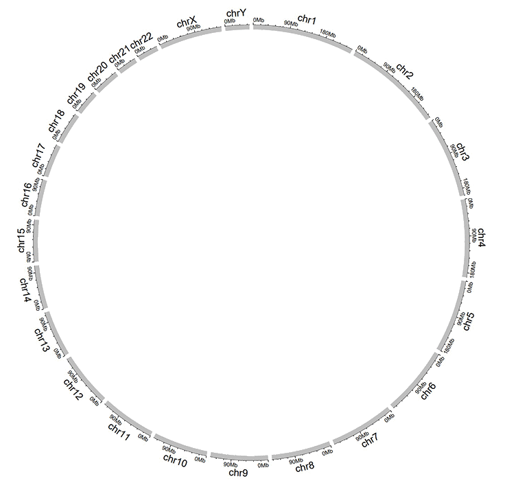
A Circos plot created with a general chromosome data.
1.2 Cytoband chromosome data with five columns
Cytoband data contains five columns in fixed order: the chromosome ID, the start and end coordinates of different genomic regions, the name of cytogenetic band, and Giemsa stain results. Column names are dispensable, and can be any valid names accepted by R.
| chr | start | end | value1 | value2 |
|---|---|---|---|---|
| chr1 | 1 | 2300000 | p36.33 | geng |
| chr1 | 2300000 | 5400000 | p36.32 | gpos25 |
| chr2 | 1 | 4400000 | p25.3 | geng |
| chr2 | 4400000 | 7100000 | p25.2 | gpos50 |
| chr3 | 1 | 2800000 | p26.3 | gpos50 |
| chr3 | 2800000 | 4000000 | p26.2 | geng |
An example cytoband chromosome data.
A Circos plot with Ideogram chromosome will be created when cytoband chromosome data is used.
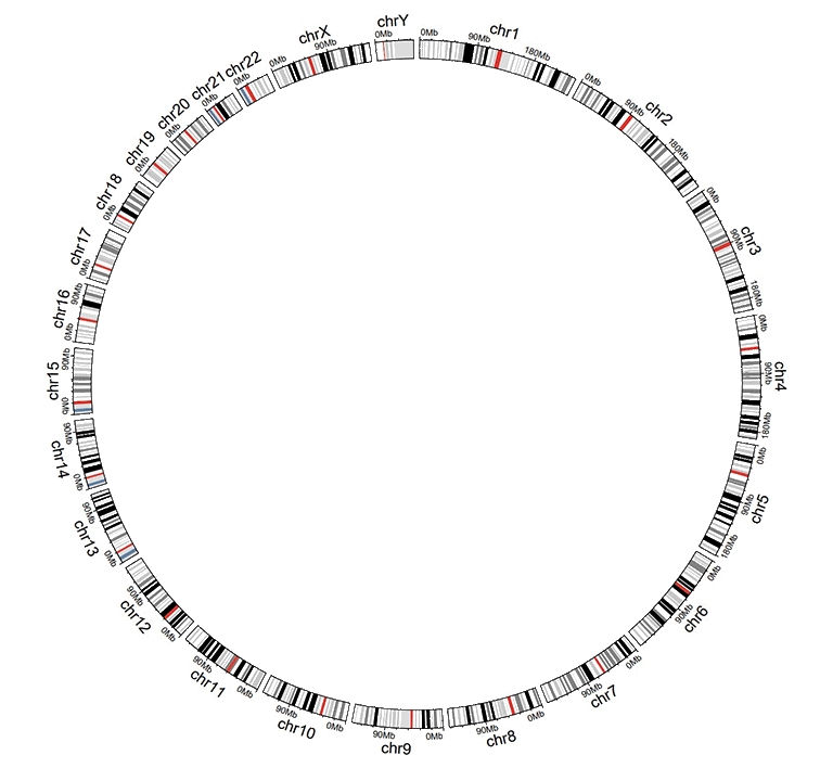
A Circos plot created with a cytoband chromosome data.
2 Track data (to be displayed in different tracks of a Circos plot)
One or multiple input datasets can be uploaded and displayed in different Tracks of a Circos diagram. Different types of plot can be created using the input datasets. Order of the first three columns of the input data for any type of plot are fixed, namely the chromosome, the start and end coordinates of genomic regions.
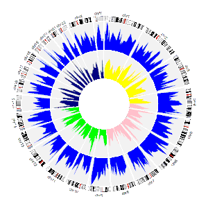
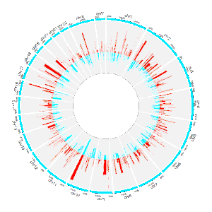
2.1 Track data to plot bars
The input data to make bar plot in a Circos diagram should contain at least four columns in fixed order: the chromosome, the start and end coordinates of genomic regions, and a fourth column with data values. Please note that the fourth column must be positive or negative numeric real numers. Names of the first four columns are dispensable, and can be any valid names accepted by R.
Two types of bar plots can be created, the unidirectional and bidirectional bar plots.
| chr | start | end | value |
|---|---|---|---|
| chr1 | 10382554 | 26901963 | 0.374 |
| chr1 | 26901963 | 30511288 | 0.084 |
| chr2 | 2129395 | 9774923 | 0.237 |
| chr2 | 14718126 | 15320740 | 0.529 |
| chr3 | 472933 | 7160480 | 0.477 |
| chr3 | 10972902 | 11789212 | 0.636 |
Input data to make unidirectional bars.
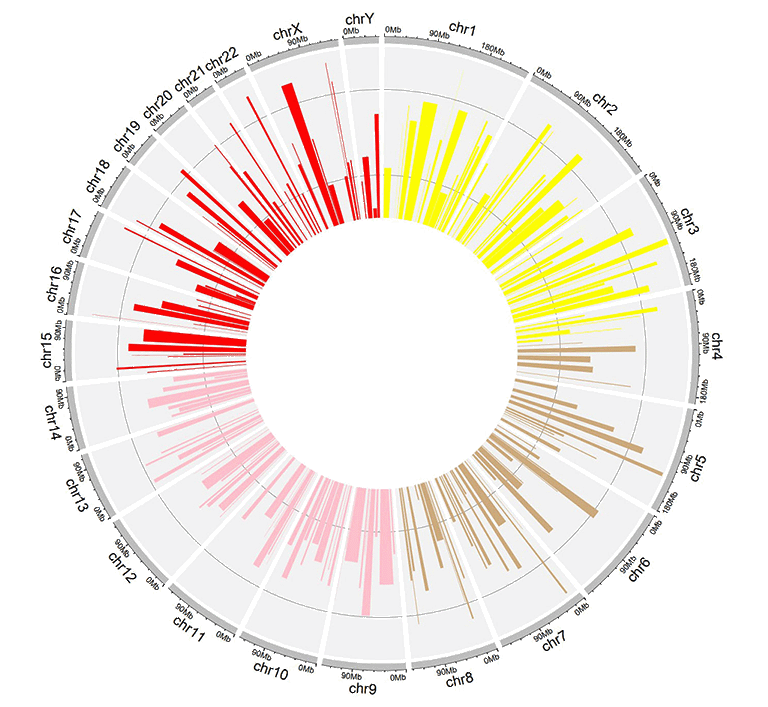
For unidirectional bar plot, the minimum value of the fourth column will be used as the starting point of all bars, as shown in the following image. By default, the color of all bars are randomly assigned by shinyCircos.
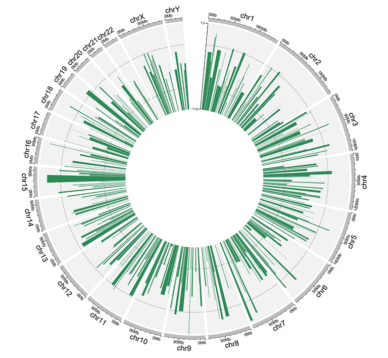
A circos plot with unidirectional bars.
For unidirectional bar plot, an additional 'color' column can be added in the input data to make colored bars in shinyCircos-V2.0. Name of the 'color' column must be explicitly specified as 'color'.
To customize color for data with multiple groups, the column indicating different groups should be named as 'color'. Users should provide a character strings assigning colors to each group. For example, 'a:red;b:green;c:blue', in which 'a b c' represent different data groups. Color for data groups without assigned color would be set as 'grey'.
| chr | start | end | value | color |
|---|---|---|---|---|
| chr1 | 2321390 | 22775301 | -0.525358698 | a |
| chr1 | 43812694 | 44287183 | 0.101162224 | a |
| chr3 | 10094726 | 13041378 | -0.117686062 | a |
| chr3 | 17700130 | 17853399 | 0.229028492 | a |
| chr4 | 58783476 | 66246991 | -0.866641798 | a |
| chr4 | 77375595 | 79033629 | -0.313168927 | b |
Input data to make colored bars.
A circos plot with colored bars.
For bidirectional bars, the 4th column which contains the data values will be divided into two groups based on the boundary value. The default boundary value is set as zero, which can be modified by the user.
| chr | start | end | value |
|---|---|---|---|
| chr1 | 5622039 | 9110831 | 0.095 |
| chr1 | 5622039 | 9110831 | -0.405 |
| chr2 | 13669568 | 16275459 | 0.936 |
| chr2 | 13669568 | 16275459 | -0.436 |
| chr3 | 4777699 | 8367346 | 0.174 |
| chr3 | 4777699 | 8367346 | -0.326 |
Input data to make bidirectional bars.
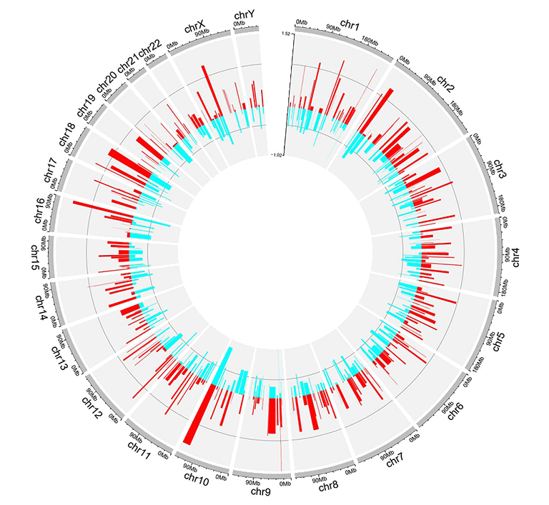
A circos plot with bidirectional bars.
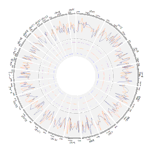
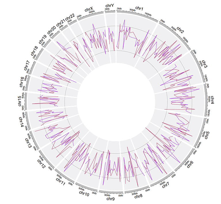
2.2 Track data to plot lines
The input data to make line chart should contain at least four columns in fixed order. The 1st column defines the chromosome of multiple genomic regions. The 2nd and 3rd columns define the start and end coordinates of these genomic regions. The fourth column is the data values of all genomic regions. Please note that the fourth column must be positive or negative numeric real numers. Names of the first four columns are dispensable, and can be any valid names accepted by R. By default, the color of all lines are randomly assigned by shinyCircos.
| chr | start | end | value |
|---|---|---|---|
| chr1 | 788538 | 5571920 | 0.309 |
| chr1 | 6704086 | 10962288 | -0.075 |
| chr2 | 5331353 | 17190915 | 0.129 |
| chr2 | 27214061 | 37578483 | -0.796 |
| chr3 | 1424915 | 5127305 | -0.413 |
| chr3 | 10792280 | 11980906 | -0.096 |
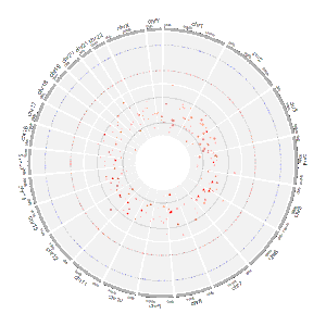
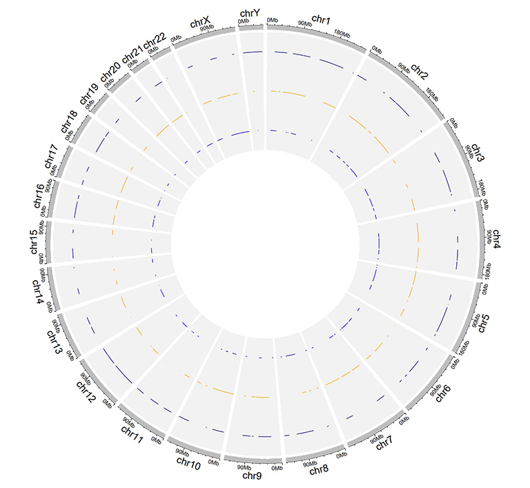
An example dataset to plot lines.
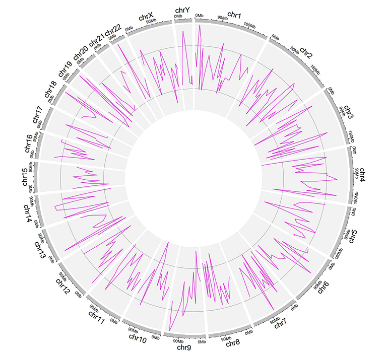
A Circos diagram with a single track of line plot.
An additional 'color' column can be added in the input dataset to assign colors to lines of different groups on the same track. Name of the 'color' column must be explicitly specified as 'color'.
| chr | start | end | value | color |
|---|---|---|---|---|
| chr1 | 2306857 | 8605927 | -0.207 | a |
| chr1 | 20851761 | 21889246 | 0.121 | a |
| chr4 | 97627526 | 102877458 | 0.259 | a |
| chr4 | 106904642 | 109386825 | -0.65 | b |
| chr14 | 84253948 | 92430157 | 0.396 | c |
| chr14 | 97757077 | 100917700 | -0.366 | c |
An input dataset with a color column to create line plot.
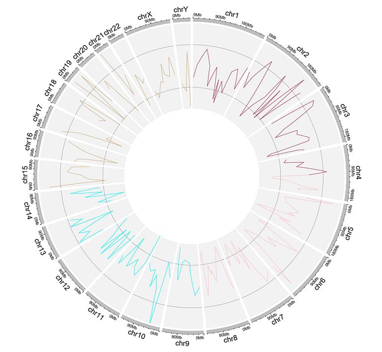
A single track of line chart with different colors for different data groups.
Multiple lines can be drawn on the same track by adding multiple columns of data values in the input dataset. For this type of input data, all column names are dispensable, and can be any valid names accepted by R.
| chr | start | end | value1 | value2 |
|---|---|---|---|---|
| chr1 | 294540 | 4666160 | -0.66 | -0.596 |
| chr1 | 17589118 | 18065224 | -0.138 | -0.747 |
| chr2 | 6872874 | 16224260 | -0.77 | -0.403 |
| chr2 | 24936258 | 28070400 | 0.716 | 0.22 |
| chr3 | 503979 | 24719267 | 0.217 | -0.459 |
| chr3 | 24979219 | 43289811 | 0.226 | -0.185 |
Example input dataset with multiple columns of data values.
A single track of line chart with multiple lines.
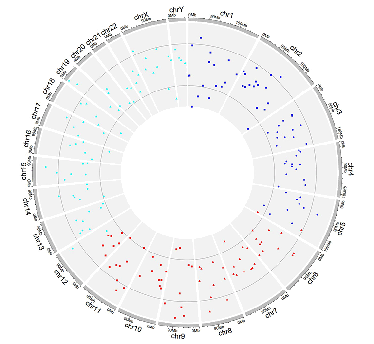
2.3 Track data to plot points
The format of input dataset to plot points is similar to the input data to make line charts.
The input data to plot points should contain at least four columns in fixed order. The 1st column defines the chromosome of multiple genomic regions. The 2nd and 3rd columns define the start and end coordinates of these genomic regions. The fourth column is the data values of all genomic regions. Please note that the fourth column must be positive or negative numeric real numers. Names of the first four columns are dispensable, and can be any valid names accepted by R. By default, the color of all points are randomly assigned by shinyCircos.
| chr | start | end | value1 |
|---|---|---|---|
| chr1 | 1769292 | 1796134 | 0.339 |
| chr1 | 4881594 | 5495466 | 1.005 |
| chr2 | 5800619 | 8815540 | 0.088 |
| chr2 | 10440452 | 10893876 | -0.891 |
| chr3 | 41265 | 7536287 | -0.1 |
| chr3 | 9209200 | 12874260 | -0.032 |
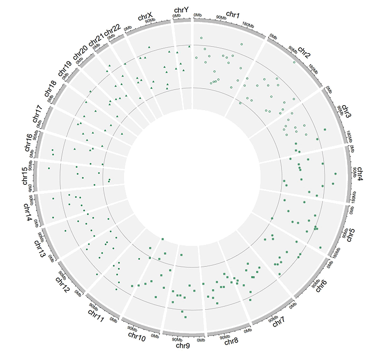
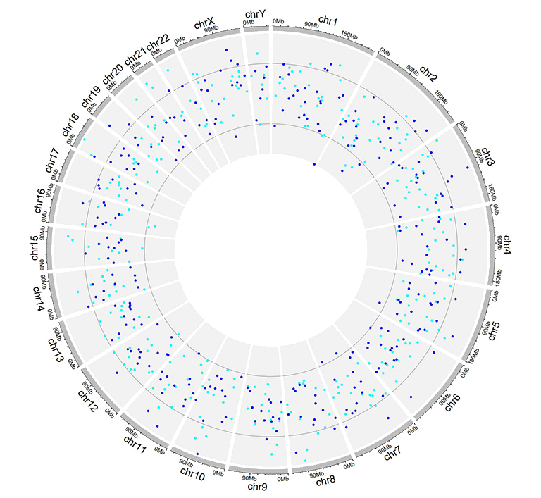
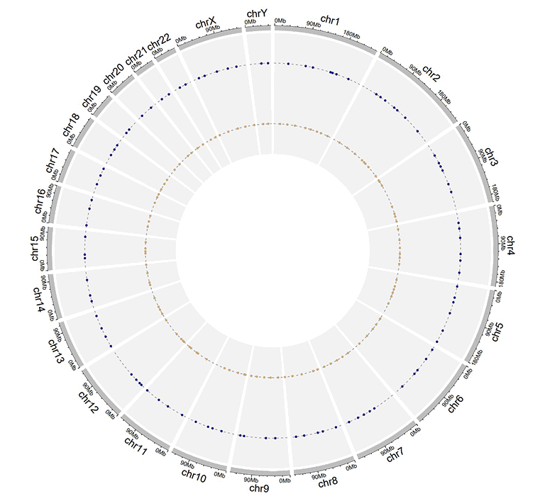
An example dataset to plot points.
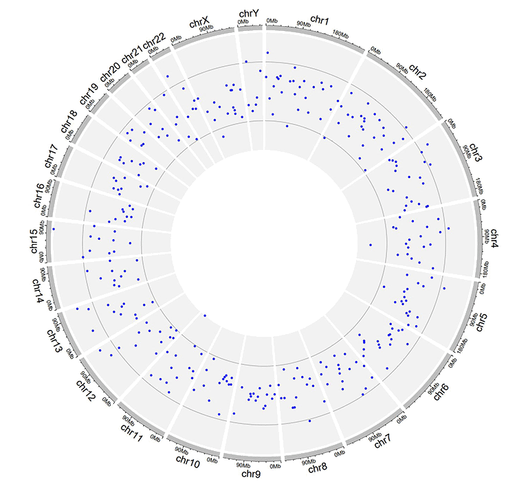
A Circos diagram with a single track of points plot.
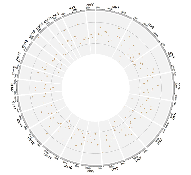
An additional 'cex' column can be added in the input data to control the size of the points. The 'cex' column should be positive numeric numbers. Name of the 'cex' column must be explicitly specified as 'cex'.
| chr | start | end | value | cex |
|---|---|---|---|---|
| chr1 | 1326341 | 1845331 | -0.374 | 0.5 |
| chr1 | 9901462 | 15656953 | -0.321 | 0.3 |
| chr2 | 17619104 | 25624262 | -0.194 | 0.6 |
| chr2 | 26946941 | 27889388 | 0.27 | 0.6 |
| chr3 | 1720430 | 4389146 | -0.319 | 0.6 |
| chr3 | 6104592 | 7216808 | 0.315 | 0.6 |
Input data to plot points with a 'cex' column.
A single track of point chart with varying point sizes.
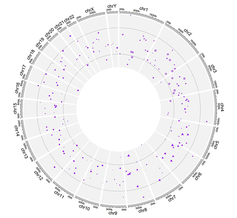
Similarly, an additional 'color' column can be added in the input data to assign colors to points of different groups on the same track. Name of the 'color' column must be explicitly specified as 'color'.
| chr | start | end | value | color |
|---|---|---|---|---|
| chr1 | 6098636 | 13915642 | 0.372 | a |
| chr1 | 42002814 | 45209039 | -0.253 | a |
| chr9 | 8290596 | 22658143 | -0.598 | c |
| chr9 | 24382136 | 34055254 | 0.279 | c |
| chrY | 30359053 | 32853733 | -0.286 | d |
| chrY | 34769699 | 39644200 | 0.343 | d |
Input data to plot points with a 'color' column.
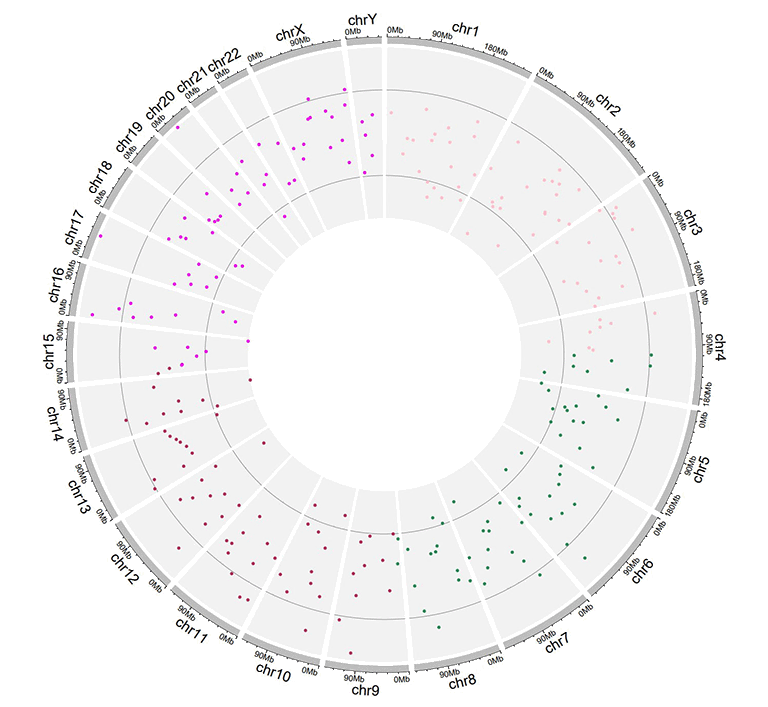
A single track of point chart with varying point colors.
Moreover, an additional 'pch' column can be added in the input data to control the shapes of points for different groups on the same track. Name of the 'pch' column must be explicitly specified as 'pch'.
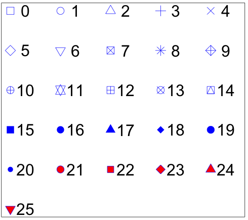
Different point shapes defined by the pch parameter in R.
(Image Source: http://coleoguy.blogspot.com/2016/06/symbols-and-colors-in-r-pch-argument.html)
| chr | start | end | value | pch |
|---|---|---|---|---|
| chr1 | 8605110 | 17214753 | 0.208 | 1 |
| chr3 | 121395059 | 124720880 | 0.269 | 1 |
| chr3 | 126119336 | 134480084 | 0.947 | 8 |
| chr7 | 59003737 | 65956990 | -0.403 | 13 |
| chr11 | 128515663 | 132431158 | 0.146 | 16 |
| chr12 | 7434839 | 18272884 | 0.766 | 16 |
Input data to plot points with a 'pch' column.
A single track of point chart with varying point shapes.
The 'cex', 'color' and 'pch' columns can appear in a single input dataset, at the same time.
| chr | start | end | value | pch | cex |
|---|---|---|---|---|---|
| chr1 | 4049230 | 11358879 | -0.59 | 10 | 0.4 |
| chr1 | 18671867 | 29619034 | 0.442 | 10 | 0.7 |
| chr4 | 72761399 | 91691619 | 0.134 | 17 | 0.4 |
| chr4 | 101737149 | 102799485 | -0.025 | 17 | 0.9 |
| chr7 | 4065399 | 7750398 | -0.327 | 17 | 0.6 |
| chr7 | 9065662 | 15775923 | 0.174 | 17 | 0.2 |
Input data to plot points with a 'pch' column and a 'cex' column.
A single track of point chart with varying point shapes and point sizes.
| chr | start | end | value | color | cex |
|---|---|---|---|---|---|
| chr1 | 8900700 | 9211013 | -0.6 | a | 0.3 |
| chr1 | 38733680 | 54945292 | 0.233 | a | 1.1 |
| chr5 | 25650709 | 32392960 | 0.409 | b | 0.3 |
| chr5 | 33011156 | 54462250 | -0.245 | b | 1.1 |
| chr7 | 86777790 | 89385025 | 0.006 | b | 0.9 |
| chr7 | 103848396 | 107618696 | -1.093 | b | 1 |
Input data to plot points with a 'color' column and a 'cex' column.
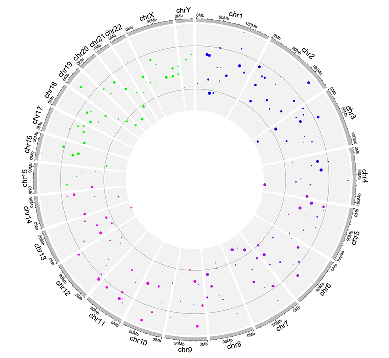
A single track of point chart with varying point colors and point sizes.
| chr | start | end | value | color | pch |
|---|---|---|---|---|---|
| chr1 | 3768320 | 4851773 | -0.416 | a | 15 |
| chr1 | 5712552 | 10112216 | -0.41 | a | 15 |
| chr10 | 5831619 | 10981299 | 0.299 | b | 15 |
| chr10 | 13728053 | 15927681 | 0.025 | b | 15 |
| chr22 | 22254151 | 36401489 | 0.182 | c | 17 |
| chr22 | 40556634 | 47770670 | -0.011 | c | 17 |
Input data to plot points with a 'color' column and a 'pch' column.
A single track of point chart with varying point colors and point shapes.
| chr | start | end | value | color | pch | cex |
|---|---|---|---|---|---|---|
| chr1 | 14053524 | 24878326 | -0.498 | a | 1 | 0.9 |
| chr1 | 29640089 | 49313488 | -0.565 | a | 1 | 1 |
| chr4 | 8408012 | 12767180 | -0.108 | b | 4 | 0.4 |
| chr4 | 22963697 | 41682972 | -0.45 | b | 4 | 0.9 |
| chr9 | 51441395 | 53095312 | 0.527 | c | 6 | 1.1 |
| chr9 | 65510881 | 69698456 | 0.127 | c | 6 | 1.1 |
Input data to plot points with a 'color' column, a 'pch' column and a 'cex' column.
A single track of point chart with varying point colors, varying point shapes, and varying point sizes.
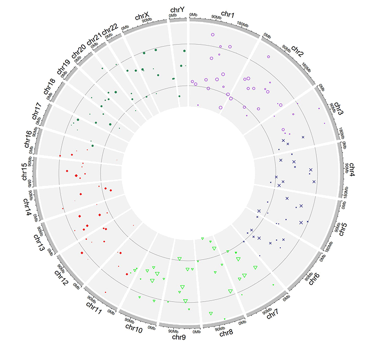
Similarly, we can also plot multiple groups of point charts by adding multiple columns of data values in the input data. For this type of input data, all column names are dispensable, and can be any valid names accepted by R.
| chr | start | end | value1 | value2 |
|---|---|---|---|---|
| chr1 | 7224218 | 16393864 | -0.196 | -0.955 |
| chr1 | 21093451 | 25392112 | 0.128 | 0.275 |
| chr3 | 14909280 | 22502495 | 0.421 | -0.185 |
| chr3 | 24704666 | 26117987 | -0.102 | 0.637 |
| chr4 | 35556750 | 37025119 | 0.063 | 0.848 |
| chr4 | 39947625 | 63436481 | 0.28 | -0.262 |
Example input dataset with multiple columns of data values.
A single track of point chart with multiple groups of points.
2.4 Track data to create ideogram
An ideogram is a graphical representation of chromosomes. In shinyCircos-V2.0, we can draw ideogram on any Track. The format of input data to create ideogram is the same as that of the Cytoband chromosome data with five columns.
| chr | start | end | value1 | value2 |
|---|---|---|---|---|
| chr1 | 1 | 2300000 | p36.33 | gneg |
| chr1 | 2300000 | 5400000 | p36.32 | gpos25 |
| chr2 | 1 | 4400000 | p25.3 | gneg |
| chr2 | 4400000 | 7100000 | p25.2 | gpos50 |
| chr3 | 1 | 2800000 | p26.3 | gpos50 |
| chr3 | 2800000 | 4000000 | p26.2 | gneg |
An example dataset to create ideogram.
A Circos diagram with a single track of ideogram.
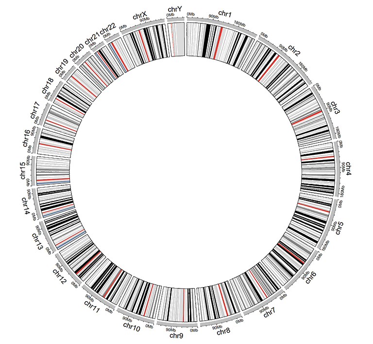
2.5 Track data to plot discrete rectangles
The input data to plot discrete rectangles should contain only four columns in fixed order. The 1st column defines the chromosome of multiple genomic regions. The 2nd and 3rd columns define the start and end coordinates of these genomic regions. The fourth column must be a chracter vector. All column names are dispensable, and can be any valid names accepted by R.
| chr | start | end | group |
|---|---|---|---|
| chr1 | 1465 | 5857186 | b |
| chr1 | 6005405 | 7051583 | c |
| chr3 | 13 | 3831804 | d |
| chr3 | 3989861 | 11612588 | g |
| chr5 | 56 | 2698252 | h |
| chr5 | 2719598 | 9370038 | c |
An example dataset to create discrete rectangles.
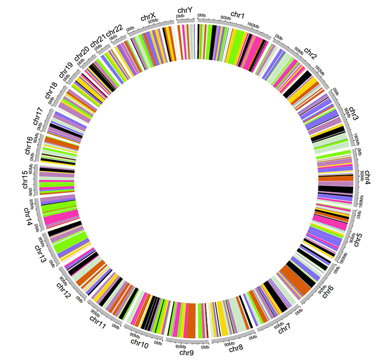
A Circos diagram with a single track of discrete rectangles.
2.6 Track data to plot gradual rectangles
The input data to plot gradual rectangles should contain only four columns in fixed order. The 1st column defines the chromosome of multiple genomic regions. The 2nd and 3rd columns define the start and end coordinates of these genomic regions. The fourth column is the data values of all genomic regions. Please note that the fourth column must be real numbers. All column names are dispensable, and can be any valid names accepted by R.
| chr | start | end | value |
|---|---|---|---|
| chr1 | 1 | 6657591 | 0.034 |
| chr1 | 9792529 | 20706145 | -0.527 |
| chr3 | 651 | 27839332 | -0.532 |
| chr3 | 28591880 | 29683518 | -0.156 |
| chr5 | 407 | 16490429 | 0.281 |
| chr5 | 17056645 | 32303717 | 0.485 |
An example dataset to create gradual rectangles.
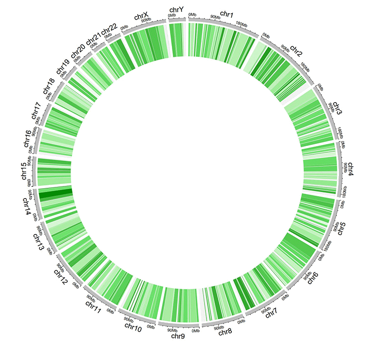
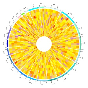
A Circos diagram with a single track of gradual rectangles.
2.7 Track data to plot discrete heatmaps
The input data to plot discrete heatmaps should contain ≥4 columns. The 1st column defines the chromosome of multiple genomic regions. The 2nd and 3rd columns define the start and end coordinates of these genomic regions. Each of the rest columns should be a chracter vector. All column names are dispensable, and can be any valid names accepted by R.
| chr | start | end | group1 | group2 | group3 | group4 | group5 | group6 | group7 | group8 | group9 | group10 |
|---|---|---|---|---|---|---|---|---|---|---|---|---|
| chr1 | 20621957 | 21209624 | d | a | a | e | e | c | d | g | g | d |
| chr1 | 42967726 | 53028972 | f | b | h | b | g | c | b | h | h | d |
| chr3 | 17138030 | 40796035 | f | h | c | f | a | a | g | h | h | h |
| chr3 | 57219142 | 60650338 | g | b | g | f | b | g | f | f | b | e |
| chr5 | 8910650 | 10080670 | f | c | e | c | b | e | h | b | a | g |
| chr5 | 13535538 | 32715550 | h | h | h | e | d | c | e | b | h | c |
An example dataset to create discrete heatmaps.
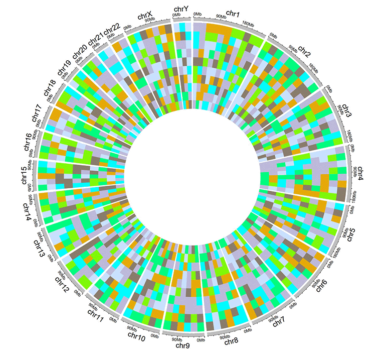
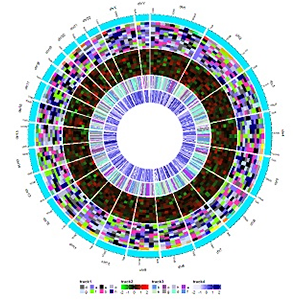
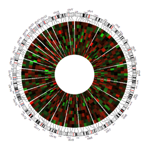
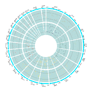
A Circos diagram with a single track of discrete heatmap.
2.8 Track data to plot gradual heatmaps
The input data to plot gradual heatmaps should contain ≥4 columns. The 1st column defines the chromosome of multiple genomic regions. The 2nd and 3rd columns define the start and end coordinates of these genomic regions. Each of the rest columns should be a numeric vector. All column names are dispensable, and can be any valid names accepted by R.
| chr | start | end | value1 | value2 | value3 | value4 | value5 | value6 | value7 | value8 | value9 | value10 |
|---|---|---|---|---|---|---|---|---|---|---|---|---|
| chr1 | 20621957 | 21209624 | -0.672 | -0.271 | -0.001 | 0.486 | -0.986 | -0.37 | 0.48 | 0.38 | 0.158 | 0.108 |
| chr1 | 42967726 | 53028972 | -0.147 | 0.387 | 1.332 | 0.182 | 0.16 | -0.132 | 0.234 | -0.089 | -0.918 | 0.397 |
| chr3 | 17138030 | 40796035 | 0.046 | 0.028 | -0.691 | -0.341 | 1.011 | -0.242 | -0.027 | -0.273 | 0.276 | -1.028 |
| chr3 | 57219142 | 60650338 | -0.514 | 0.429 | 0.29 | -0.356 | -0.025 | 0.537 | -0.368 | 0.486 | 0.392 | -0.085 |
| chr5 | 8910650 | 10080670 | 0.175 | -0.855 | 0.934 | -0.914 | 0.879 | -0.181 | -0.512 | -0.074 | 0.302 | 0.04 |
| chr5 | 13535538 | 32715550 | 0.088 | 0.005 | 1.005 | -0.076 | -0.007 | 0.371 | 0.494 | -0.236 | 0.219 | -0.422 |
An example dataset to create gradual heatmaps.
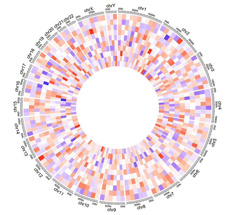
A Circos diagram with a single track of gradual heatmap.
2.9 Track data to plot stack-point
Using shinyCircos-V2.0, we can also create stack point chart. The input data should contain only four columns in fixed order. The 1st column defines the chromosome of multiple genomic regions. The 2nd and 3rd columns define the start and end coordinates of these genomic regions. The fourth column represents the group of different data values. And data values of the same group will be plotted on the same line. Column names are dispensable, which can also be any valid names accepted by R..
| chr | start | end | stack |
|---|---|---|---|
| chr1 | 11589909 | 40133642 | a |
| chr1 | 52614734 | 59580026 | a |
| chr5 | 28358375 | 28943627 | a |
| chr1 | 87453098 | 89776607 | b |
| chr5 | 6608219 | 8525932 | b |
| chr5 | 39324082 | 40131031 | b |
An example dataset to create stack points.
A Circos diagram with a single track of stack points.
2.10 Track data to plot stack-line
Similarly, we can also create stack line chart using shinyCircos-V2.0. The input data format is the same as the input data for stack-point.
| chr | start | end | stack |
|---|---|---|---|
| chr1 | 20646359 | 46383846 | a |
| chr5 | 2723623 | 5392944 | a |
| chr9 | 4943376 | 8560799 | a |
| chr5 | 89644 | 46679748 | b |
| chr9 | 29528190 | 72792793 | b |
| chr13 | 22993703 | 23901290 | b |
An example dataset to create stack lines.
A Circos diagram with a single track of stack lines.
3 Label data (used to label elements in a track)
Label data is used to annotate the elements in a specified track with text labels. The input data should contain four or five columns, as shown in the table below.
The four-column label data is used to draw labels with a uniform color. By default, the color for label text is assigned as "black", which can be specified by the user with a widget implemented in shinyCircos. Column names for four-column label data is dispensable, and can be any valid names accepted by R.
| chr | start | end | label |
|---|---|---|---|
| chr1 | 3698046 | 3736201 | TP73 |
| chr1 | 156114670 | 156140089 | LMNA |
| chr5 | 42423775 | 42721878 | GHR |
| chr5 | 150113839 | 150155859 | PDGFRB |
| chr9 | 116153792 | 116402321 | PAPPA |
| chr9 | 21967752 | 21975133 | CDKN2A |
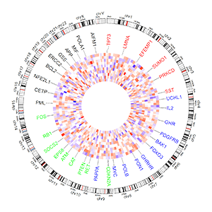
An example four-column label data.
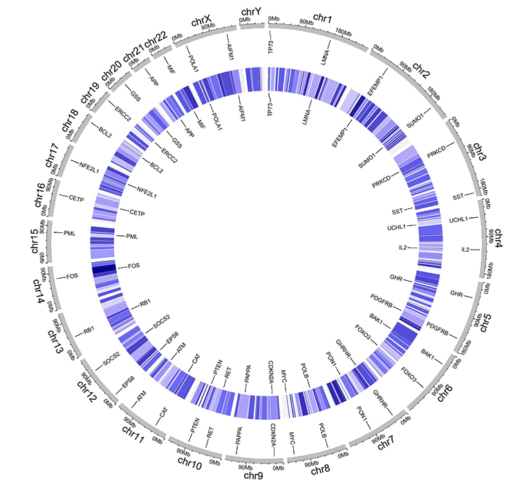
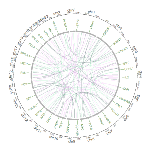
An example Circos diagrams with text labels.
The five-column label data is used to draw labels with varying colors specified by the user. Column names are dispensable. Names of all five columns can be any valid names accepted by R. Each value in the 5th column should be a valid color name.
| chr | start | end | label | color |
|---|---|---|---|---|
| chr1 | 3698046 | 3736201 | TP73 | red |
| chr1 | 156114670 | 156140089 | LMNA | #FF000080 |
| chr5 | 42423775 | 42721878 | GHR | blue |
| chr5 | 150113839 | 150155859 | PDGFRB | blue |
| chr9 | 116153792 | 116402321 | PAPPA | blue |
| chr9 | 21967752 | 21975133 | CDKN2A | green |
An example label data with a 'color' column.
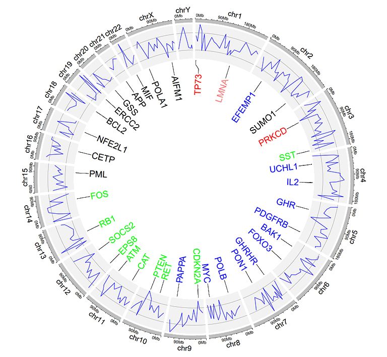
An example Circos diagrams with label text in different colors.
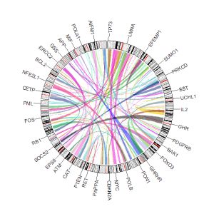
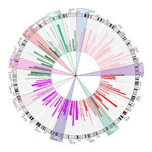
4 Links data
The links data should contain six or seven columns. The first three columns define the chromosome, the start and end coordinates of multiple genomic regions. The 4-6th columns of the input dataset define the chromosome, the start and end coordinates of another set of genomic regions. Links will be created between all pairs of genomic regions in the same line of the input dataset. By default, the color of all links are randomly assigned by shinyCircos.
For six-columns links input data, column names is dispensable, and can be any valid names accepted by R.
For seven-columns links input data, column names is indispensable. Names of the first six columns can be any valid names accepted by R. Name of the 7th column must be explicitly specified as 'color'.
| chr1 | start1 | end1 | chr2 | start2 | end2 |
|---|---|---|---|---|---|
| chr20 | 37720821 | 47419255 | chr5 | 162124929 | 168434522 |
| chr8 | 76179361 | 83302661 | chr1 | 162049212 | 213797379 |
| chr2 | 38375277 | 49805216 | chr11 | 19060895 | 36294068 |
| chr2 | 120255288 | 134792772 | chr13 | 62362083 | 71502856 |
| chr4 | 95199225 | 102508113 | chr13 | 16327889 | 24910342 |
| chr15 | 83769167 | 83992136 | chr10 | 83790329 | 119443216 |
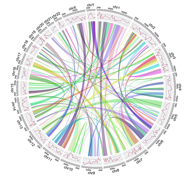
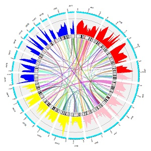
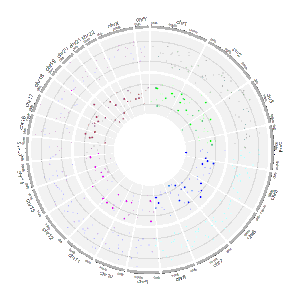
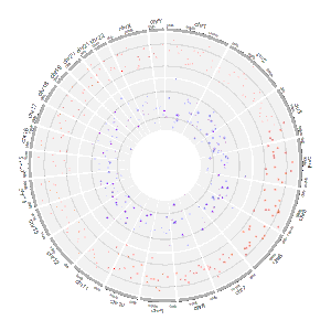
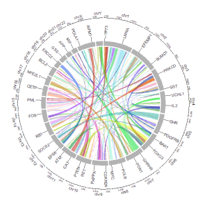
An example Circos diagrams with links.
For seven-columns links input data, the 7th 'color' column can be a character vector or a numeric vector.
| chr1 | start1 | end1 | chr2 | start2 | end2 | color |
|---|---|---|---|---|---|---|
| chr20 | 37720821 | 47419255 | chr5 | 162124929 | 168434522 | c |
| chr8 | 76179361 | 83302661 | chr1 | 162049212 | 213797379 | c |
| chr2 | 38375277 | 49805216 | chr11 | 19060895 | 36294068 | b |
| chr2 | 120255288 | 134792772 | chr13 | 62362083 | 71502856 | a |
| chr4 | 95199225 | 102508113 | chr13 | 16327889 | 24910342 | a |
| chr15 | 83769167 | 83992136 | chr10 | 83790329 | 119443216 | b |
An example links dataset with a color column of characters.
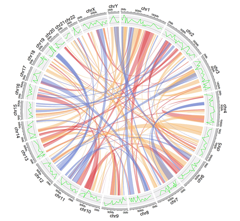
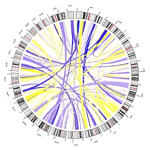
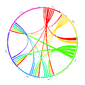
An example Circos diagrams with links colored by different groups.
| chr1 | start1 | end1 | chr2 | start2 | end2 | color |
|---|---|---|---|---|---|---|
| chr20 | 37720821 | 47419255 | chr5 | 162124929 | 168434522 | 217 |
| chr8 | 76179361 | 83302661 | chr1 | 162049212 | 213797379 | 7 |
| chr2 | 38375277 | 49805216 | chr11 | 19060895 | 36294068 | 206 |
| chr2 | 120255288 | 134792772 | chr13 | 62362083 | 71502856 | 27 |
| chr4 | 95199225 | 102508113 | chr13 | 16327889 | 24910342 | 189 |
| chr15 | 83769167 | 83992136 | chr10 | 83790329 | 119443216 | 161 |
An example links dataset with a color column of numeric numbers.
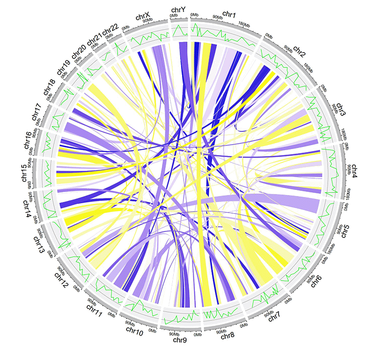
An example Circos diagrams with links of gradual colors.
Contents
Input data format
1 Chromosome data (used to define the chromosomes of a Circos plot)
1.1 General data with three columns
1.2 Cytoband data with five columns
2 Track data (to be displayed in different tracks of a Circos plot)
2.1 Track data to plot bars
2.2 Track data to plot lines
2.3 Track data to plot points
2.4 Track data to create ideogram
2.5 Track data to plot discrete rectangles
2.6 Track data to plot gradual rectangles
2.7 Track data to plot discrete heatmaps
2.8 Track data to plot gradual heatmaps
2.9 Track data to plot stack-point
2.10 Track data to plot stack-line
3 Label data (used to label elements in a track)
4 Links data
Use shinyCircos online or on local computer
1 Use shinyCircos-V2.0 online
The URL to use shinyCircos-V2.0 online is https://venyao.xyz/shinyCircos/.
2 Interface of shinyCircos-V2.0
The shinyCircos-V2.0 application contains 8 main menus: "shinyCircos-V2.0", "Data Upload", "Circos Parameters", "Circos Plot", "Gallery", "Help", "About" and "Contact". The "shinyCircos-V2.0" menu gives a brief introduction to the shinyCircos-V2.0 application.
The home page of shinyCircos-V2.0.
The "Data Upload" menu allows the user to upload their own input data from the local disk or load example datasets from shinyCircos.
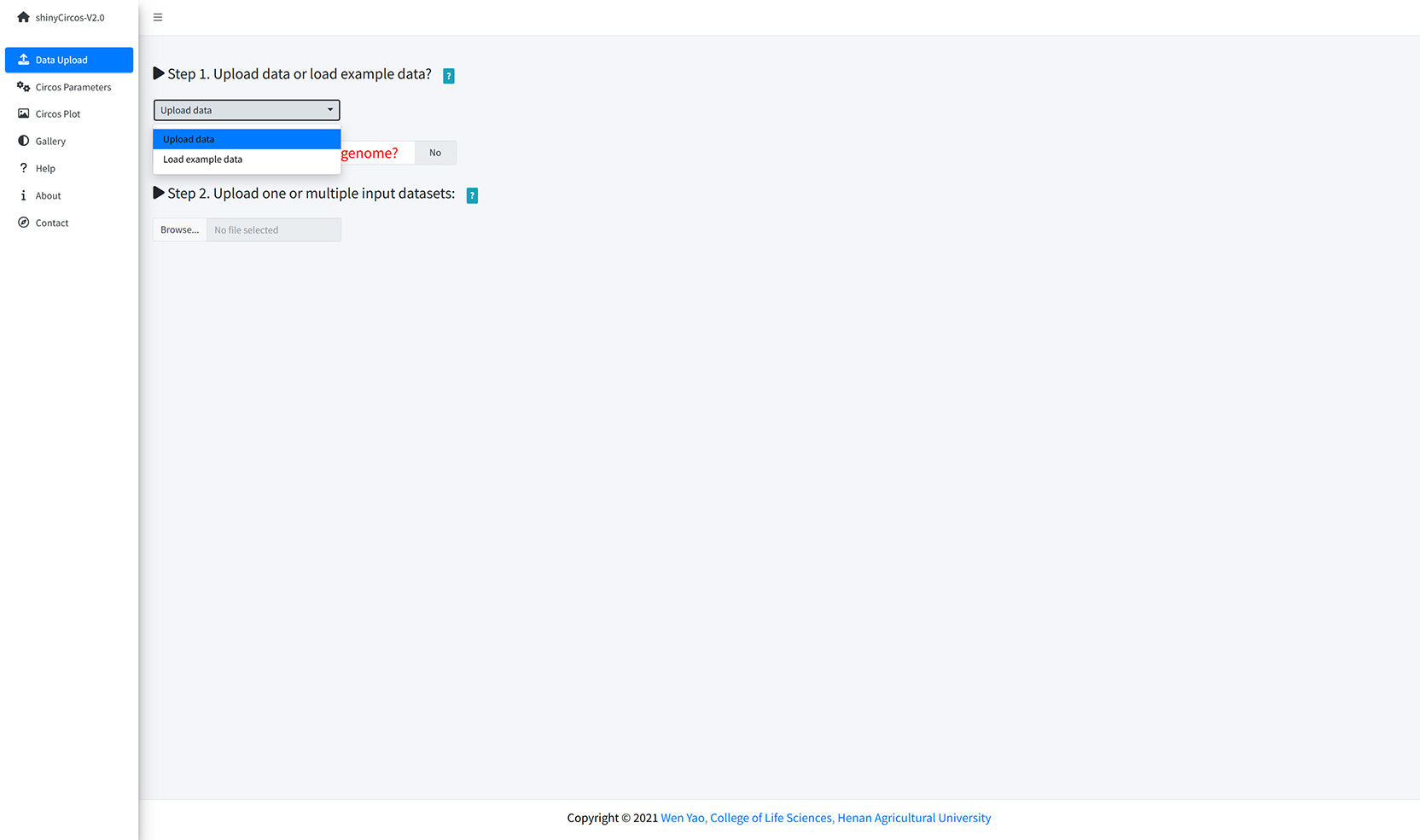
Upload data or load example data?
You can upload multiple datasets at the same time or upload them separately. Remember to save the uploaded data timely. When all input datasets were properly uploaded, please drag the uploaded datasets from the 'Candidate area' to the box of 'Chromosome data' or 'Track data' or 'Label data' or 'Links data', and then Click the 'Save uploaded data' button.
Upload input data from local disk.
The users can also choose to load example datasets stored in shinyCircos. A total of 10 different example datasets are stored in shinyCircos.
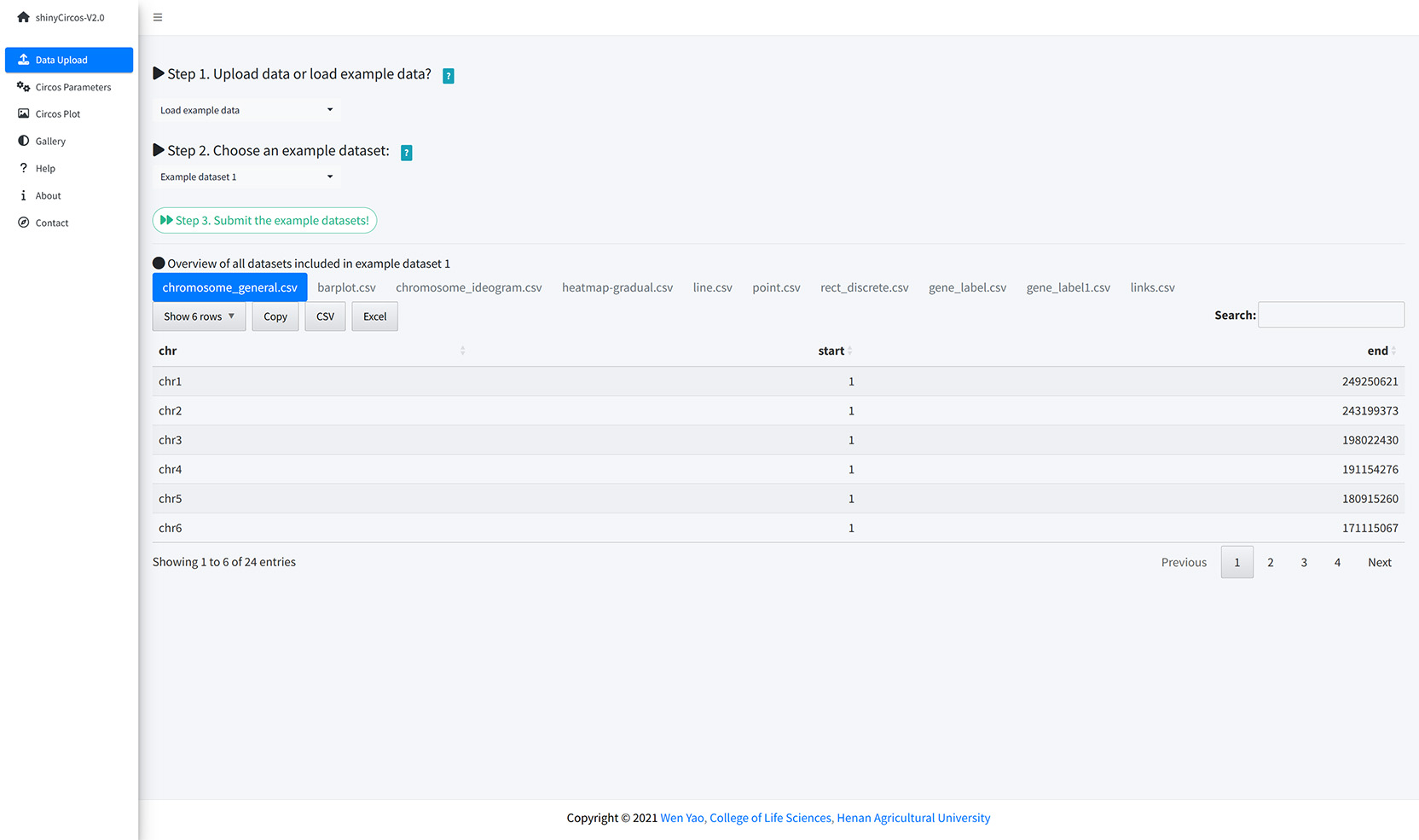
Load example data from shinyCircos.
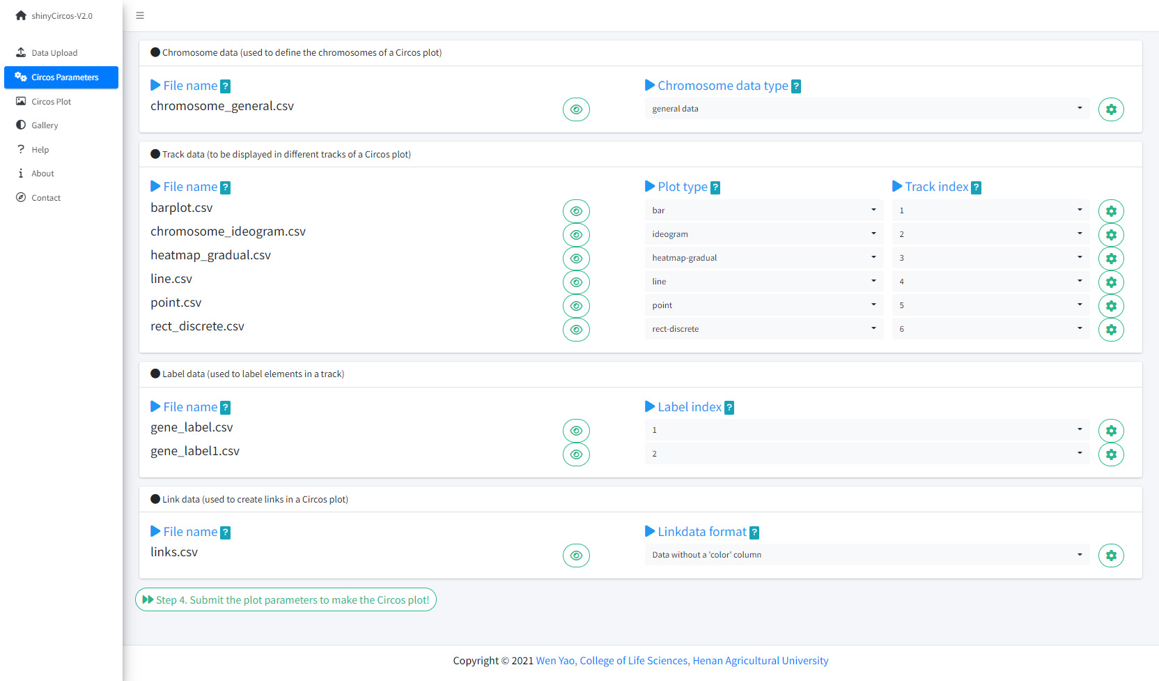
The "Circos Parameters" provided functionalities for users to view the contents of all uploaded datasets, and the functionalities for users to set parameters for each input dataset. The input datasets are categorized into four groups, including Chromosome data, Track data, Label data and Links data. The filename of each input dataset is diaplayed in a single row of this page. And the content of each dataset can be viewed by clicking the eye icon beside the corresponding file name. For each input dataset, the user is required to set the plot type and other plotting parameters. A small gear at the end of each row is designed for users to set the plotting parameters.
The Circos Parameters page of shinyCircos-V2.0.
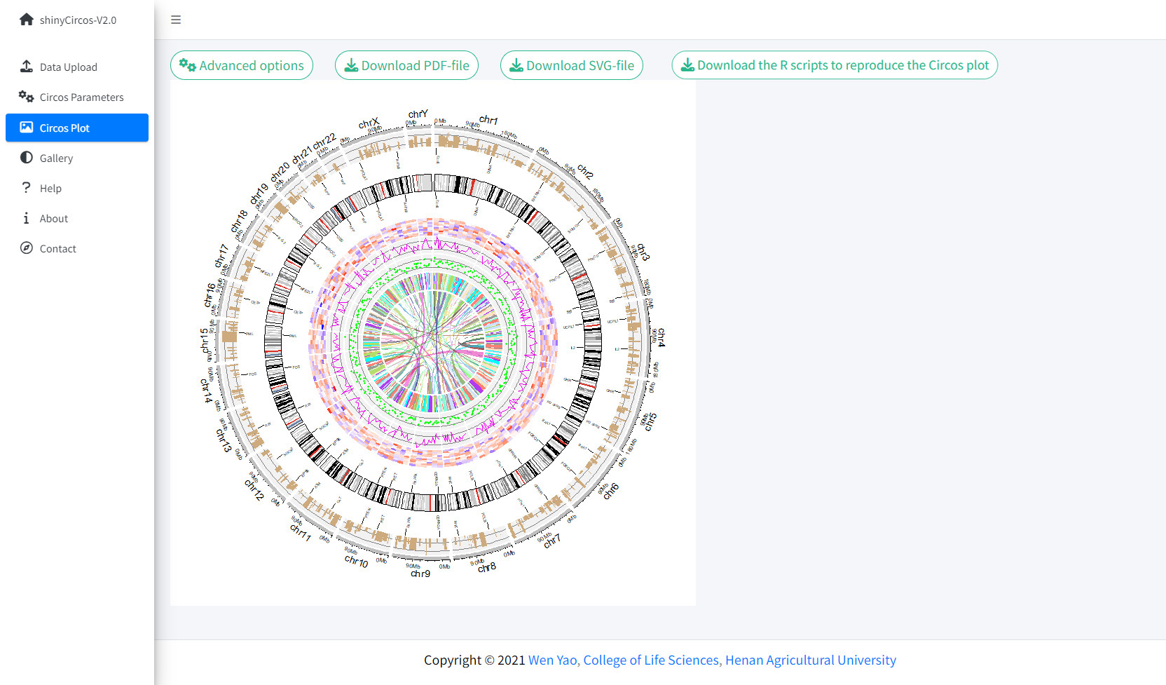
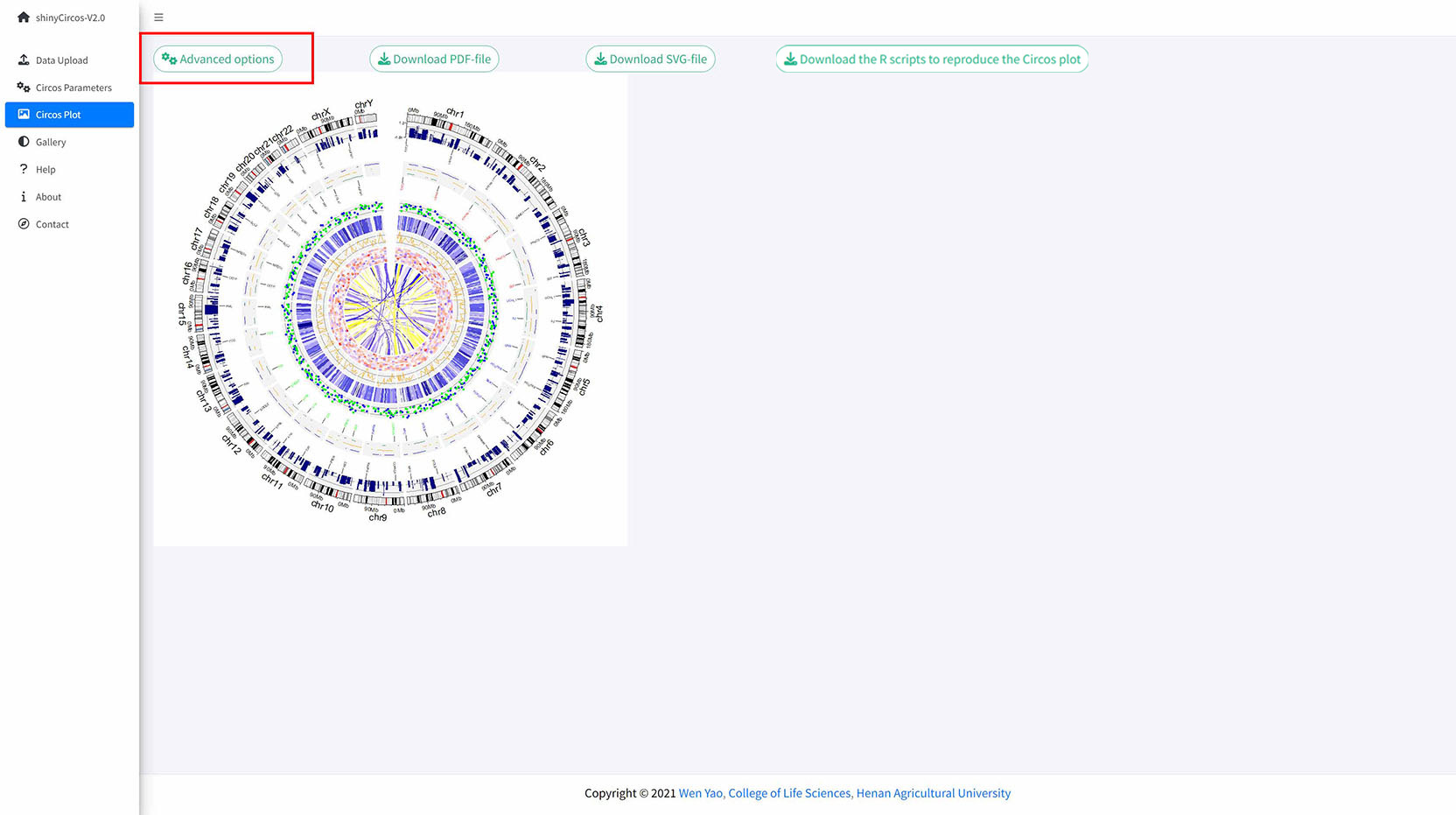
Once all the input datasets and the parameters were submitted to the shinyCircos server, a Circos plot will be created and displayed in the 'Circos plot' page of shinyCircos-V2.0. The created Circos plot can be downloaded in PDF or SVG format. Several advanced options to tune the appearance of the created Circos plot are implemented under the 'Advanced options' button.
The Circos Plot page of shinyCircos-V2.0.
Thirty example Circos plots created with shinyCircos-V2.0 are listed in the "Gallery" menu of the shinyCircos-V2.0. The input datasets used to create each example plot are also provided for downloading.
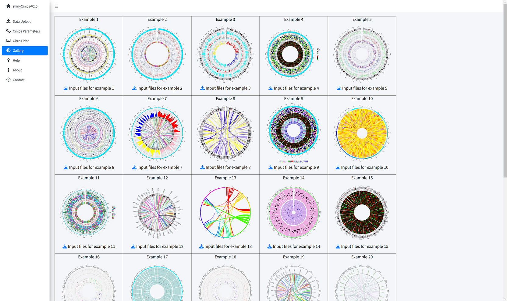
The Gallery page of shinyCircos-V2.0.
Help tutorials on the usage of shinyCircos-V2.0 are provided in the Help page.
The Help page of shinyCircos-V2.0.
The dependent R packages used by shinyCircos-V2.0 and other information are given in the "About" menu of shinyCircos-V2.0.
The About page of shinyCircos-V2.0.
Contact information is given in the "Contact" page of shinyCircos-V2.0.
The Contact page of shinyCircos-V2.0.
3 Install and use shinyCircos-V2.0 on local computers
Users can choose to install and run shinyCircos-V2.0 on a personal computer (Windows, Mac or Linux) without uploading data to the server of shinyCircos-V2.0. shinyCircos-V2.0 is a cross-platform application, i.e. shinyCircos-V2.0 can be installed on any platform with an available R environment. The installation of shinyCircos-V2.0 consists of three steps.
Step 1. Install R and RStudio
Please check CRAN (https://cran.r-project.org/) for the installation of R. Please check https://www.rstudio.com/ for the installation of RStudio.
Step 2. Install the R/Shiny package and other R packages required by shinyCircos-V2.0
Start an R session with RStudio and run the following lines:
        # try an http CRAN mirror if https CRAN mirror doesn't work
        install.packages("shiny")
        install.packages("circlize")
        install.packages("bs4Dash")
        install.packages("DT")
        install.packages("RColorBrewer")
        install.packages("shinyWidgets")
        install.packages("data.table")
        install.packages("shinyBS")
        install.packages("sortable")
        install.packages("shinyjqui")
        install.packages("shinycssloaders")
        install.packages("colourpicker")
        install.packages("gridBase")
        install.packages("randomcoloR")
        install.packages("gtools")
        install.packages("BiocManager")
        BiocManager::install("ComplexHeatmap")
Make sure all the packages are installed correctly.
Step 3. Run the shinyCircos-V2.0 application
Start an R session with RStudio and run the following lines:
shiny::runGitHub("shinyCircos-V2.0", "YaoLab-Bioinfo")This command will download the source code of shinyCircos-V2.0 from GitHub to a temporary directory on your computer, and then launch the shinyCircos-V2.0 application in a web browser. The downloaded shinyCircos-V2.0 code will be deleted from your computer once the web browser is closed. The next time you run this command in RStudio, it will download the source code of shinyCircos-V2.0 from GitHub again to a temporary directory. This process is cumbersome because it takes some time to download the shinyCircos-V2.0 code from GitHub.
We recommended that users download the source code of shinyCircos-V2.0 from GitHub to a fixed directory on your computer, such as "E:\apps" on Windows. A zip file named "shinyCircos-V2.0-master.zip" will be downloaded to your computer. Move this file to "E:\apps" and unzip this file. Then a directory named "shinyCircos-V2.0-master" will be generated in "E:\apps". The scripts "server.R" and "ui.R" can be found in "E:\apps\shinyCircos-V2.0-master". You can then start the shinyCircos-V2.0 application by running the following lines in RStudio.
Download the source code of shinyCircos-V2.0 from GitHub.
        library(shiny)
        runApp("E:/apps/shinyCircos-V2.0-master", launch.browser = TRUE)
The shinyCircos-V2.0 application will then be opened in your computer's default web browser.
Contents
Use shinyCircos online or on local computer
1 Use shinyCircos-V2.0 online
2 Interface of shinyCircos-V2.0
3 Install and use shinyCircos-V2.0 on local computer
Step 1. Install R and RStudio
Step 2. Install the R/Shiny package and other R packages required by shinyCircos-V2.0
Step 3. Run the shinyCircos-V2.0 application
Steps to create a Circos diagram with shinyCircos-V2.0
To make a Circos plot using shinyCircos-V2.0, the user must prepare and upload a file that defines the chromosomes of a specific genome, as well as other input data to be displayed along the genome. In this section, we will demonstrate all the basic steps to create a Circos diagram using example datasets.
1 Basic steps to create a Circos diagram with shinyCircos-V2.0
Step 1. Upload a single "Chromosome data" to define the chromosomes of a Circos plot
A chromosome data is indispensable for shinyCircos-V2.0, as it defines the chromosomes of a Circos plot. The detailed format of a Chromosome data is described in the "2 Input data format" section.
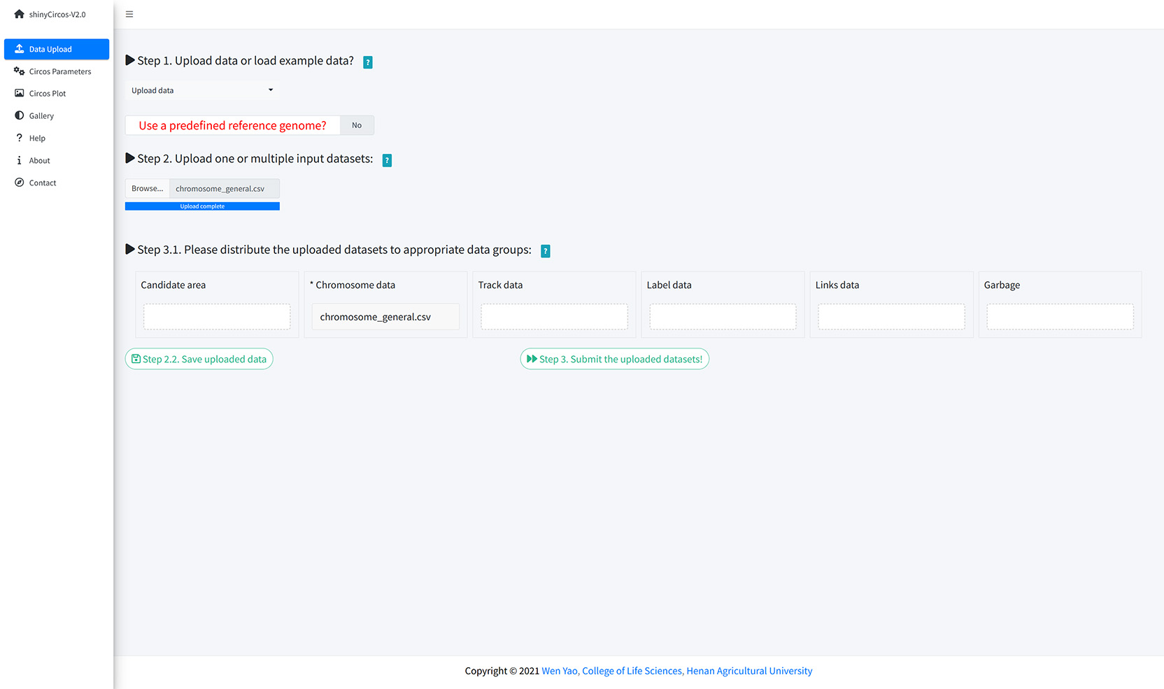
A file named as 'chromosome_general.csv' was uploaded from the local disk to to shinyCircos-V2.0 using the data upload widget implemented in the "Data Upload" menu of the shinyCircos-V2.0 application, as shown in the figure below.
Upload a chromosome data.
Step 2. Upload one or multiple input datasets to be displayed in different Tracks
Except for a Chromosome data, one or multiple other input datasets can be uploaded to shinyCircos-V2.0, to be displayed in different trakcs of a Circos plot. The detailed format of input files to make different types of plot is detailed in the "2 Input data format" section. Here, two files named as "barplot.csv" and "line.csv" were uploaded from local disk to shinyCircos-V2.0. Both datasets were distributed into the 'Track data' box. Remember to save the uploaded data timely.
Step 3. Set the "Track" index and plot type for each input dataset
By default, the track index for the input datasets were determined by the order of uploading. And the default plot type for all input datasets were set as 'point'. Here, we need to set the plot type for "barplot.csv" as 'bar', and set the plot type for "line.csv" as 'line'.
Set Track index and plot type in the Circos Parameters page of shinyCircos-V2.0.
Step 4. Click the "Submit!" button to create the Circos plot
When the track indedx and plot type were correctly setted for all the input datasets, please click the "Step 4. Submit the plot parameters to make the Circos plot!" button at the bottom of the "Circos Parameters" page to make the desired Circos plot. By default, random colors or predefined colors will be used by shinyCircos-V2.0 if necessary.
2 Update a Circos plot by replacing one or more input datasets
A track of a Circos plot is usually defined by a single input dataset. And a typical Circos plot usually contains multiple tracks defined by multiple input datasets. From time to time, we may want to replace one or more of these input files so that we can update some tracks of a Circos plot without recreating the entire plot.
For example, we want to create a Circos plot with discrete rectangles by replacing "line.csv" in Track 2 (Section 4.1) with a new input file "rect_discrete.csv".
To achieve this, we can go to the "Data Upload" page and upload "rect_discrete.csv" to shinyCircos-V2.0, distribute the "rect_discrete.csv" file into the "Track data" box, and move the "line.csv" file to the "Garbage" box. After that, we should click the "Step 2.2. Save uploaded data" button. At the same time, we need to change the plot type of the newly uploaded dataset from 'line' to "rect_discrete".
Finally, we need to click the "Step 4. Submit the plot parameters to make the Circos plot!" button at the bottom of the "Circos Parameters" panel to update the Circos plot.
3 Download the created Circos plot in PDF or SVG format
The created Circos plot can be downloaded as a PDF or a SVG file using the widgets "Download PDF-file" and "Download SVG-file" on the top of the "Circos Plot" page. By default, the two files are named as "shinyCircos.pdf" and "shinyCircos.svg", respectively. The downloaded PDF file can be opened in Adobe Acrobat, while the downloaded SVG file "shinyCircos.svg" can be opened in Google Chrome browser.
Options to download the created Circos plot.
4 Steps to make a complex Circos diagram with shinyCircos-V2.0
Using shinyCircos-V2.0, 10 different types of graphs, including point, line, bar, stack-line, stack-point, rect-gradual, rect-discrete, heatmap-gradual, heatmap-discrete and ideogram, can be created. To create a Circos graph, at least one input data file is required, that is, a Chromosome data file that defines the length of the genome.
In this section, we will show the steps to create a complex Circos diagram with shinyCircos-V2.0.
Step 1. Upload all input data and distribute each dataset to appropriate data groups.
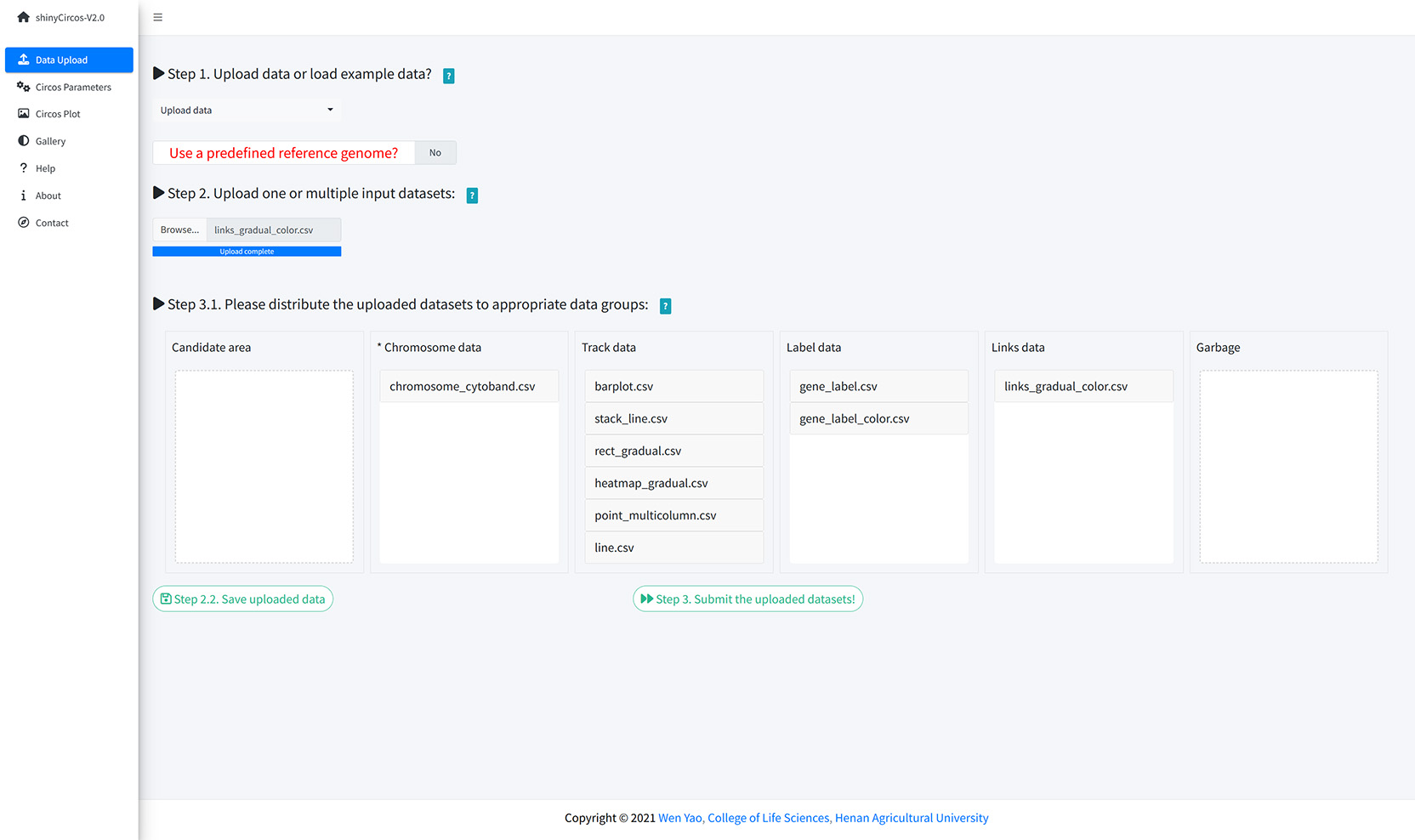
Upload all input data and distribute each dataset to appropriate data groups.
Step 2. Set plot type and track index for each input data.
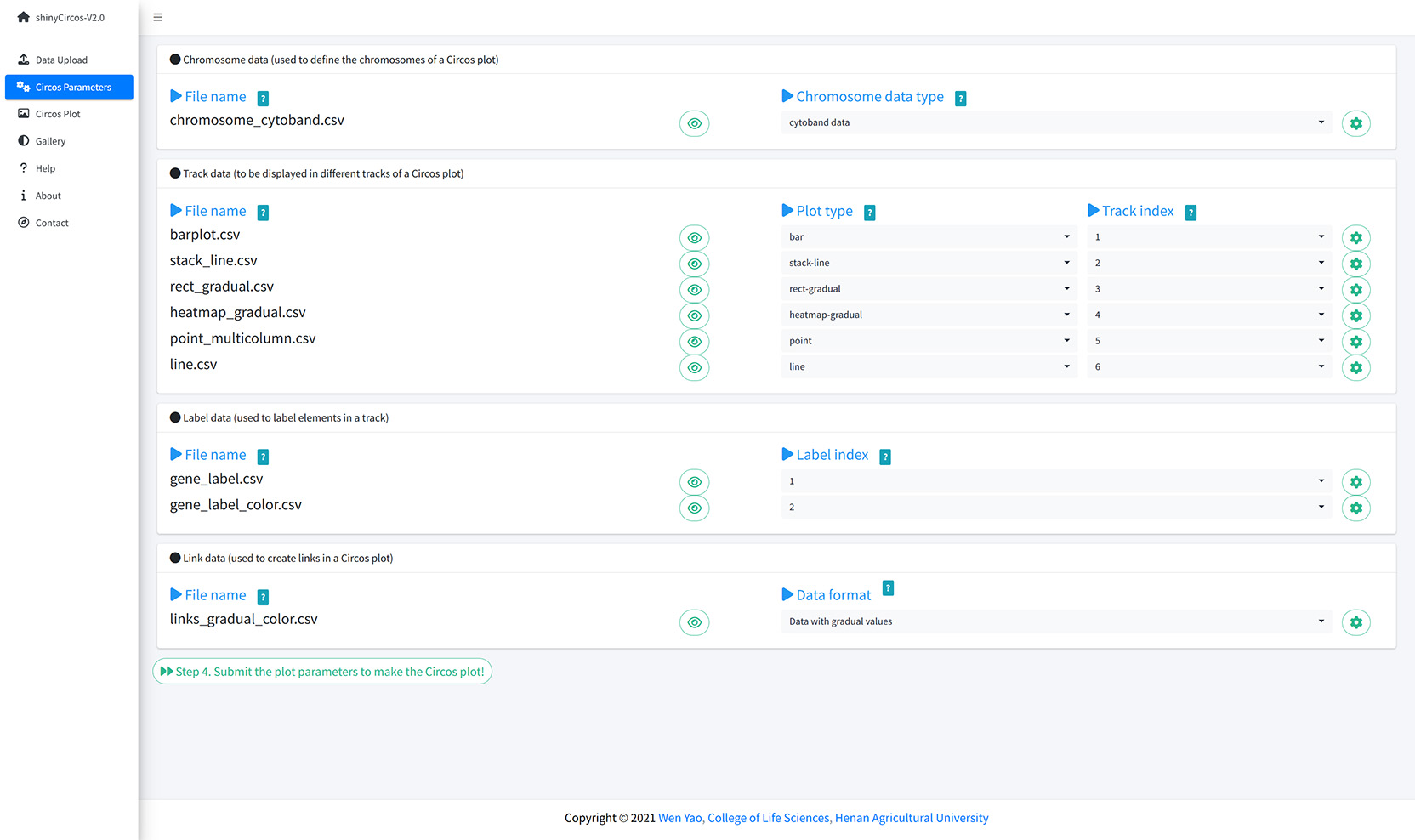
Set plot type and track index for each input data.
Step 3. Set parameters for each input data.
Ser parameters for a bar plot.
Step 4. Set advanced parameters.
The 'Advanced options' widget in the 'Circos plot' menu.
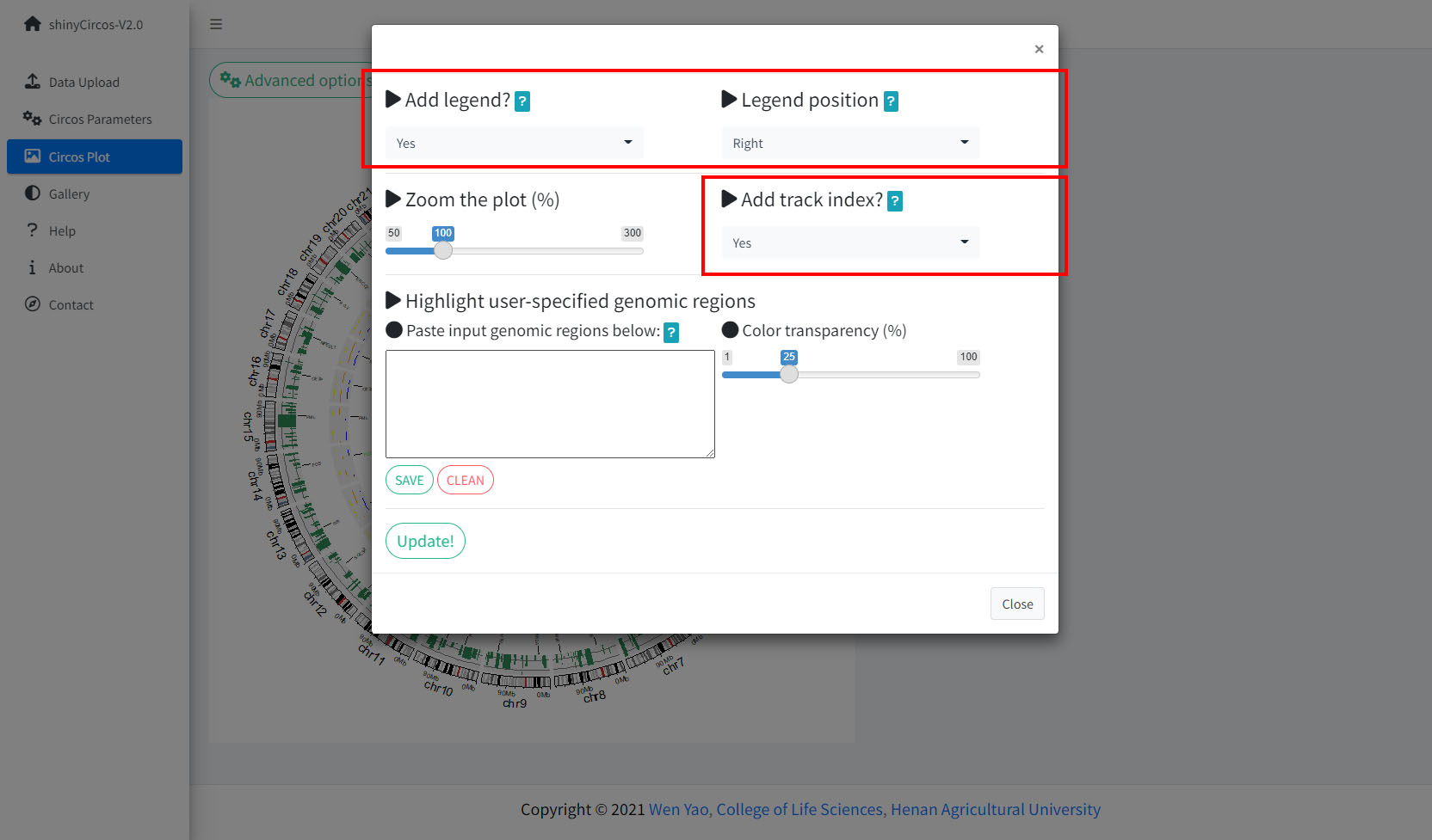
Advanced options implemented in shinyCircos-V2.0.
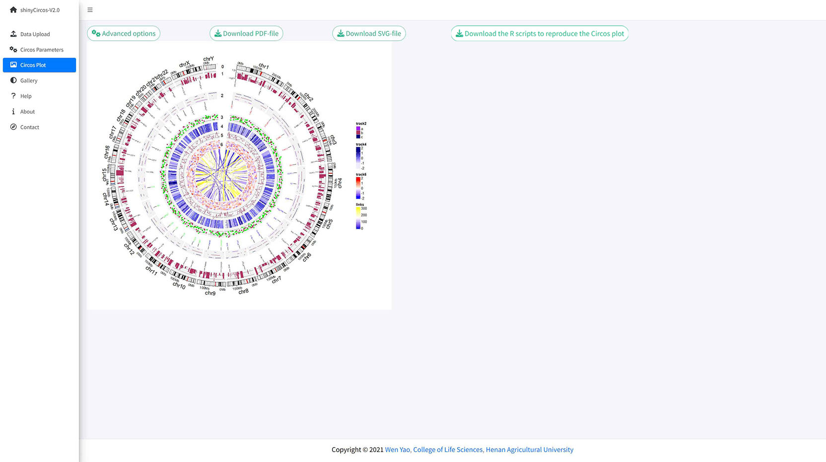
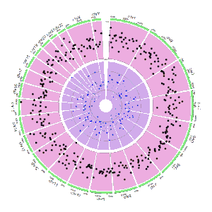
A Circos plot with Track index and figure legend.
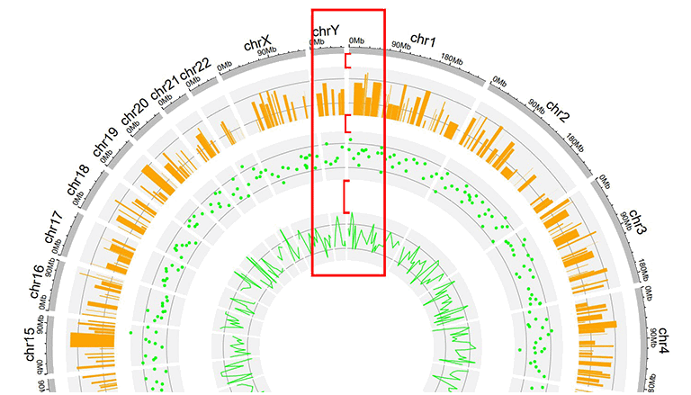
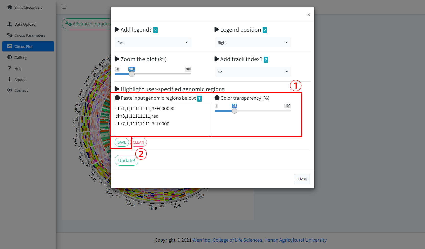
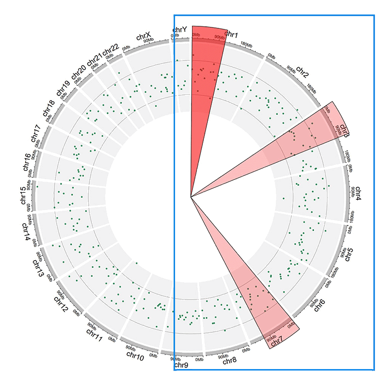
Step 5. Highlight a genomic region.
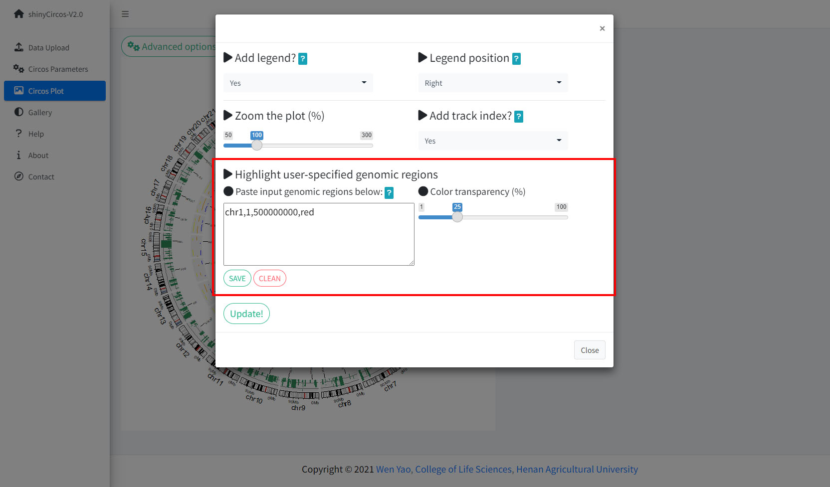
The widget implemented in shinyCircos-V2.0 to highlight one or multiple user-input genomic regions.
Remember to click the "SAVE" button to input the genomic regions and check the data format. Remember to click the "Update!" button to bring all the set advanced options into effect.
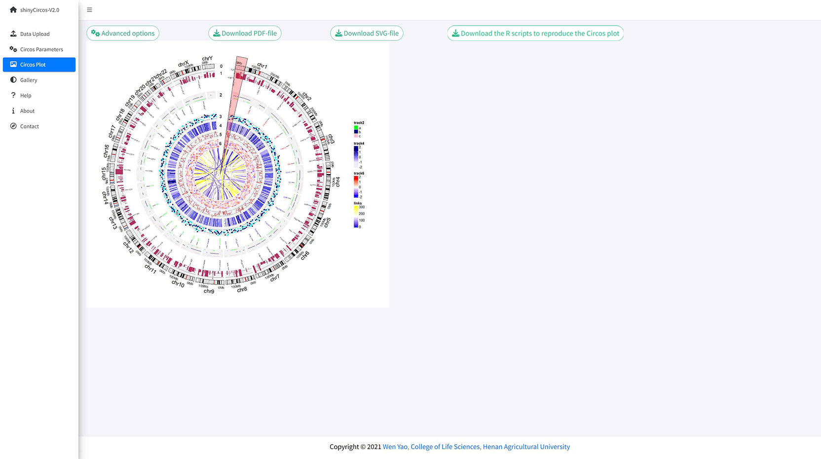
A circos plot with a user-input genomic region highlighted.
Contents
Steps to create a Circos diagram with shinyCircos-V2.0
1 Basic steps to create a Circos diagram with shinyCircos-V2.0
Step 1. Upload a single "Chromosome data" to define the chromosomes of a Circos plot
Step 2. Upload one or multiple input datasets to be displayed in different Tracks
Step 3. Set the "Track" index and plot type for each input dataset
Step 4. Click the "Submit!" button to create the Circos plot
2 Update a Circos plot by replacing one or more input datasets
3 Download the created Circos plot in PDF or SVG format
4 Steps to make a complex Circos diagram with shinyCircos-V2.0
Step 1. Upload all input data and distribute each dataset to appropriate data groups
Step 2. Set plot type and track index for each input data
Step 3. Set parameters for each input data
Step 4. Set advanced parameters
Step 5. Highlight a genomic region
Plot options to decorate a Circos plot
In the "Circos Parameters" menu, a small gear button is displayed at the rightmost of each input dataset. By clicking this button, a page with multiple widgets will pop up for users to set parameters for the corresponding input data. Setting of several parameters are demonstrated in this section.
1 Track height
The default Track height is set as 0.1. The track height can be increased by turning up this number.
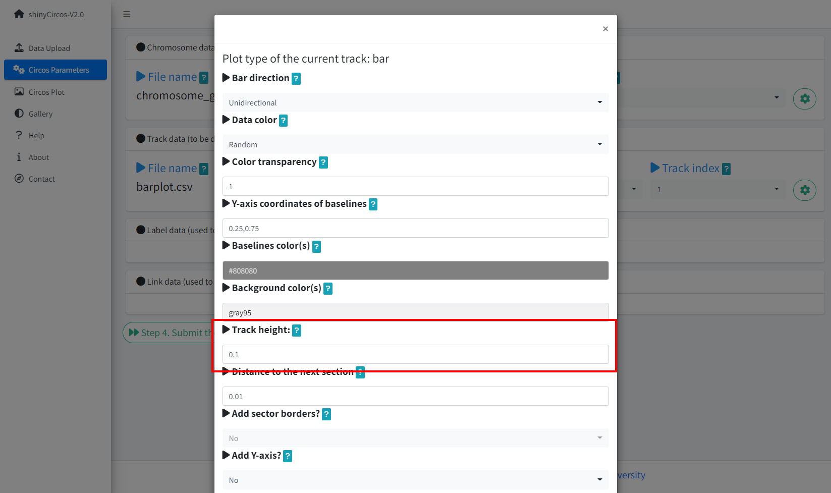
Options to increase the track height of a Circos plot.
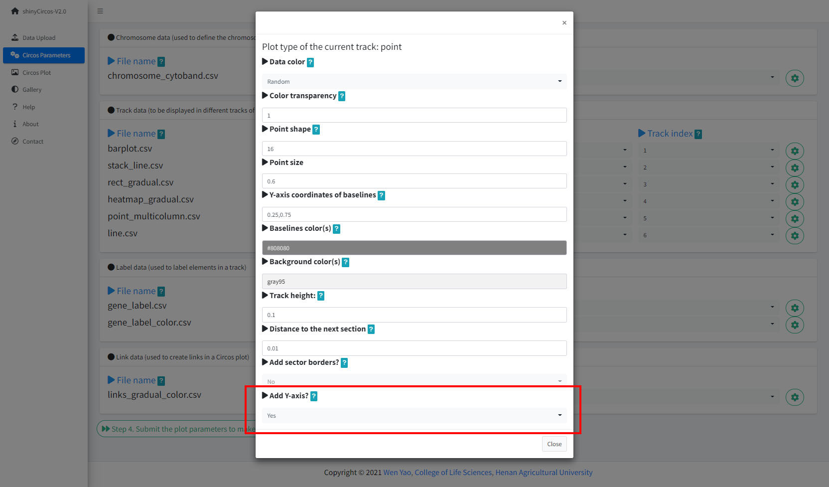
2 Y-axis
shinyCircos-V2.0 now supports adding a Y-axis to a specified track, to display the range of data values for the corresponding track.
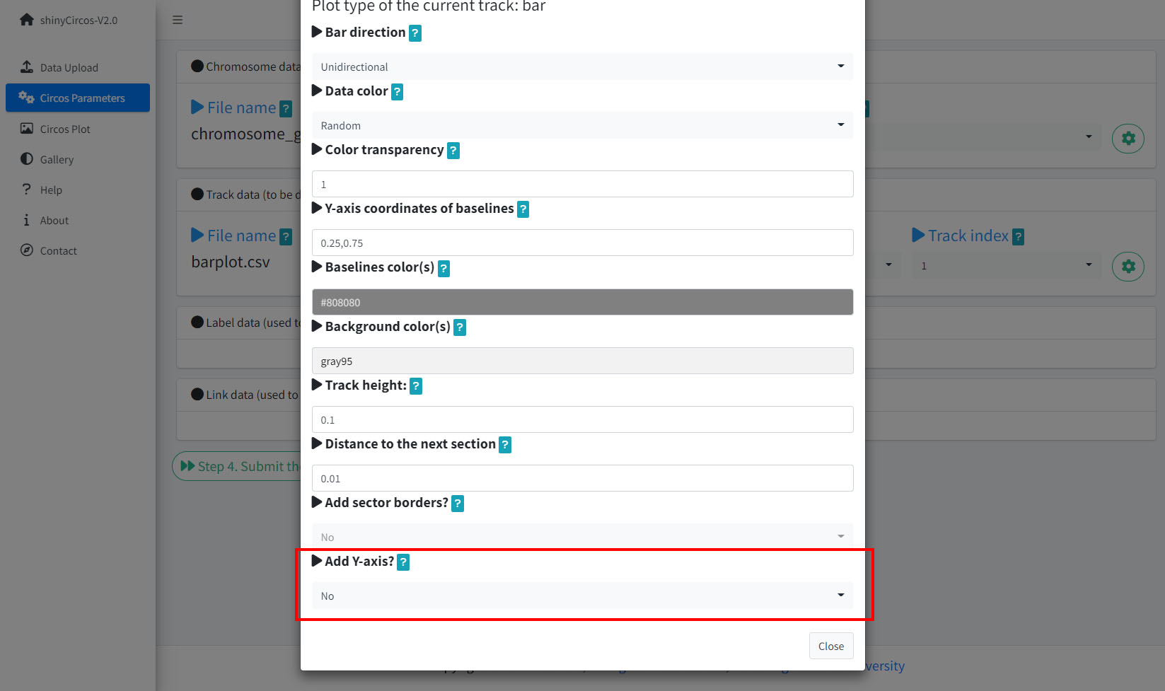
Options to add Y-axis for a track in a Circos plot.
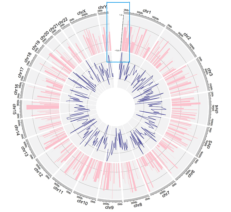
A Circos plot with Y-axis.
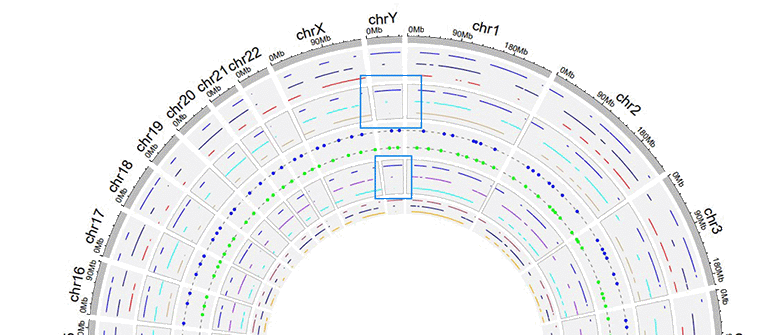
3 Distances between adjacent tracks
This parameter is designed to tune the distance between adjancent tracks, which can also be used to tune the distance between a track and a label data, or the distance between a track and a link data.
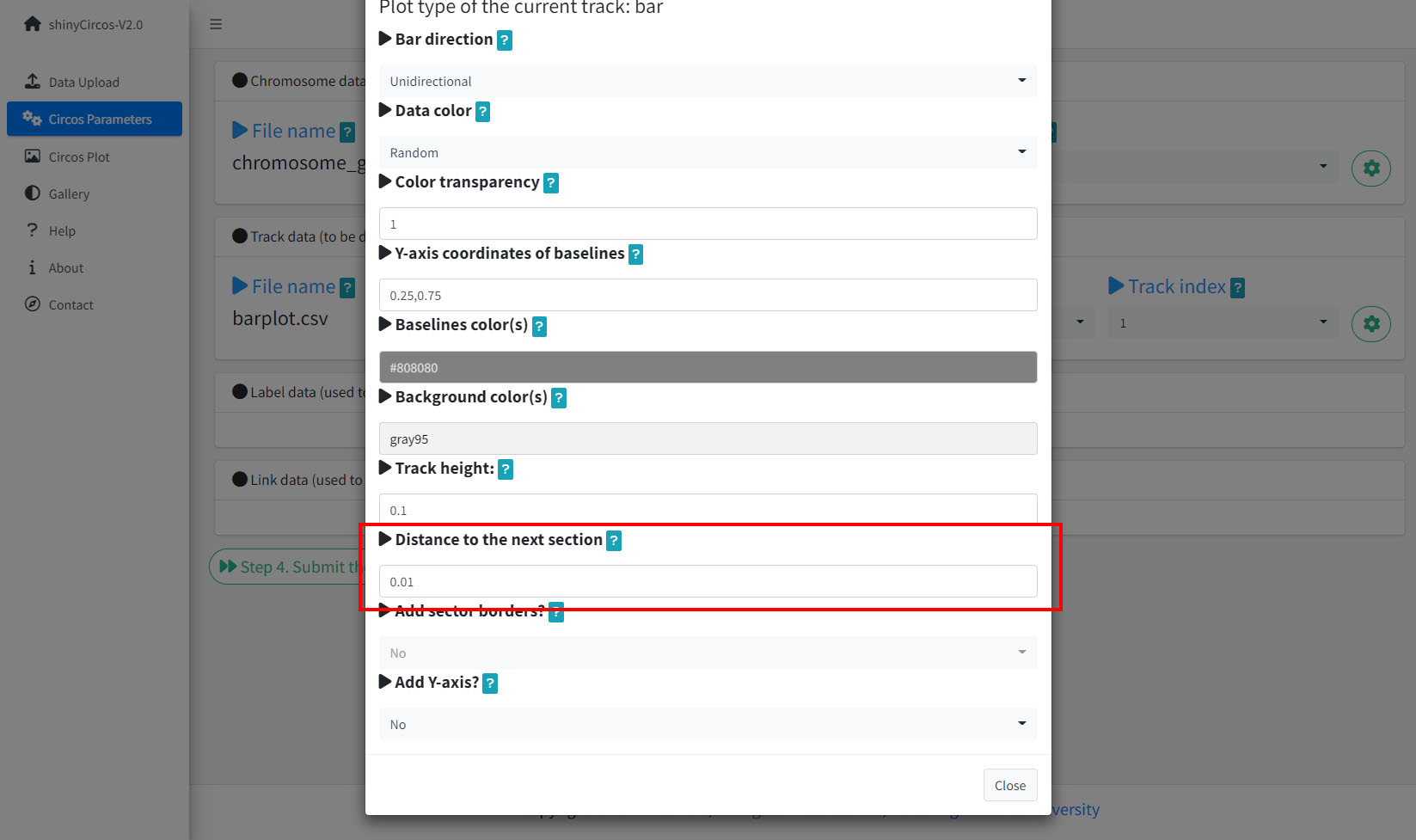
Options to adjust the distances between adjacent tracks.
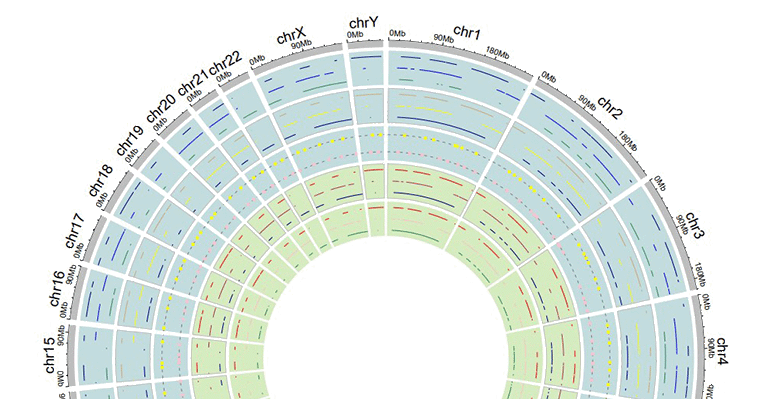
A Circos plot with larger gaps between adjacent tracks.
4 Sector border
shinyCircos-V2.0 also supports adding sector borders to one or multiple "Tracks" to emphasize these Tracks.
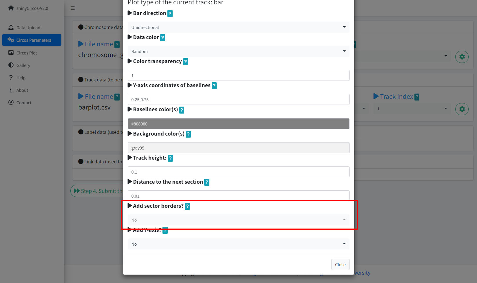
Options to add sector borders.
A Circos plot with sector borders.
5 Background color of a "Track"
In shinyCircos-V2.0, users can adjust the background color of different Tracks to distinguish different tracks. The color can be null or a color vector of arbitrary length adjusted automatically to the number of sectors. For example, 'grey95' or 'grey95,grey,pink,yellow'. Hex color codes as '#FF0000' are also supported.
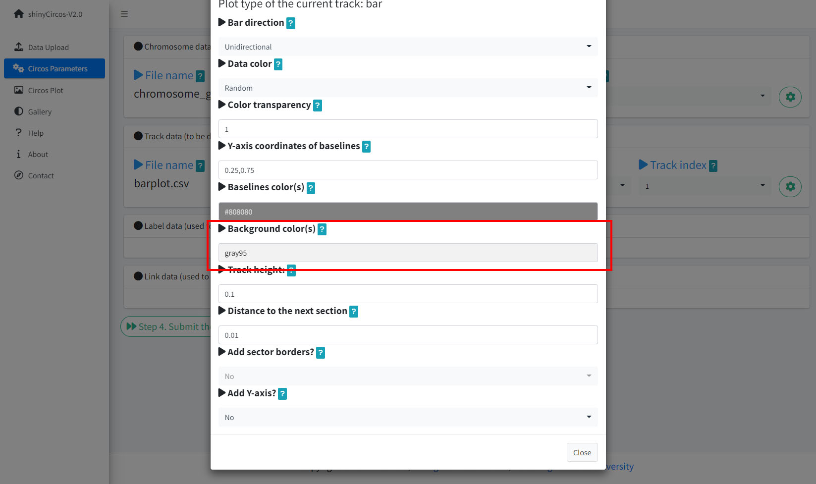
Options to change the background color of the current Track.
Tracks with different background colors in a Circos plot.
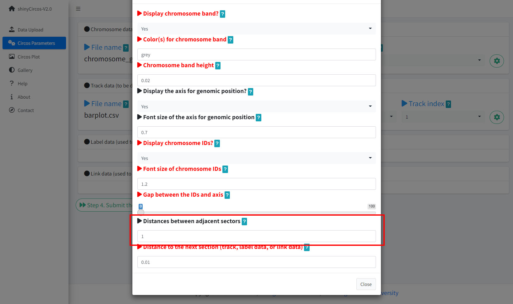
6 Distances between adjacent sectors
This parameter is used to tune the gap size between adjacent sectors. Numeric vector of arbitrary length is accepted and adjusted automatically to the number of sectors. For example, '1' or '1,2,3,1'. The first value corresponds to the gap between the first and the second sector.
Options to adjust the distances between adjacent setcors.
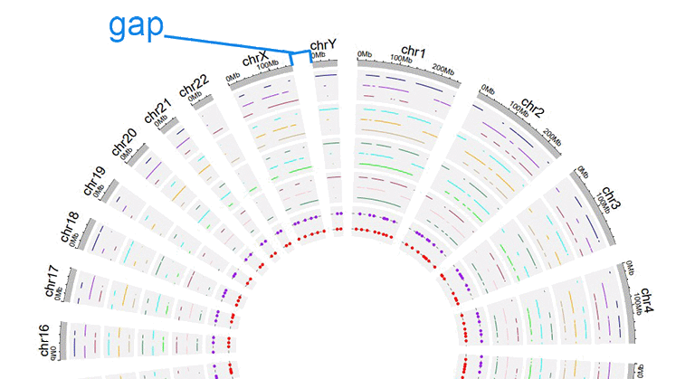
A circos plot with larger gap size between adjacent sectors.
Advanced features
Compared with the previous version of shinyCircos, we developed several advanced features in shinyCircos-V2.0.
1 Add legend
For any of the plot type including "stack-line", "stack-point", "heatmap-gradual", "heatmap-discrete", "rect-gradual" and "rect-discrete", a figure legend can be added to the created Circos plot using the widget in "Advanced options" of the "Circos Plot" menu. The figure legend can be placed at the bottom or right side of the Circos plot.
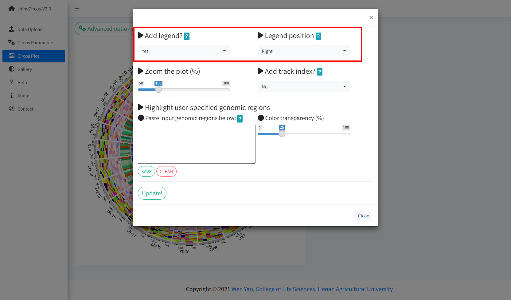
Options to add figure legend for a Circos plot.
A Circos diagram with figure legend.
2 Highlight specific genomic regions
shinyCircos-V2.0 supports highlighting one or multiple genomic regions of a Circos plot. This functionality is implemented in the "Advanced options" button of the "Circos Plot" menu.
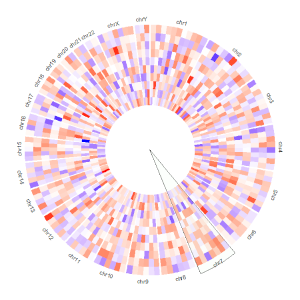
Options to highlight one or multiple genomic regions.
A Circos diagram with highlighted genomic regions.
3 Adjust plot size
shinyCircos-V2.0 supports resizing of a created Circos plot, using the widget shown below.
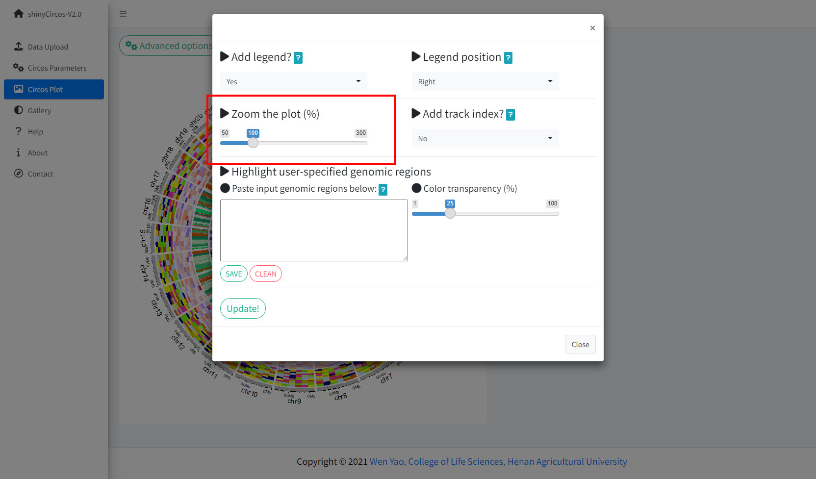
Options to adjust the size of a Circos Plot.
4 Add "Track index"
shinyCircos-V2.0 supports adding index to all the tracks of a Circos plot to distinguish different tracks. This functionality is implemented in the "Advanced options" button of the "Circos Plot" menu.
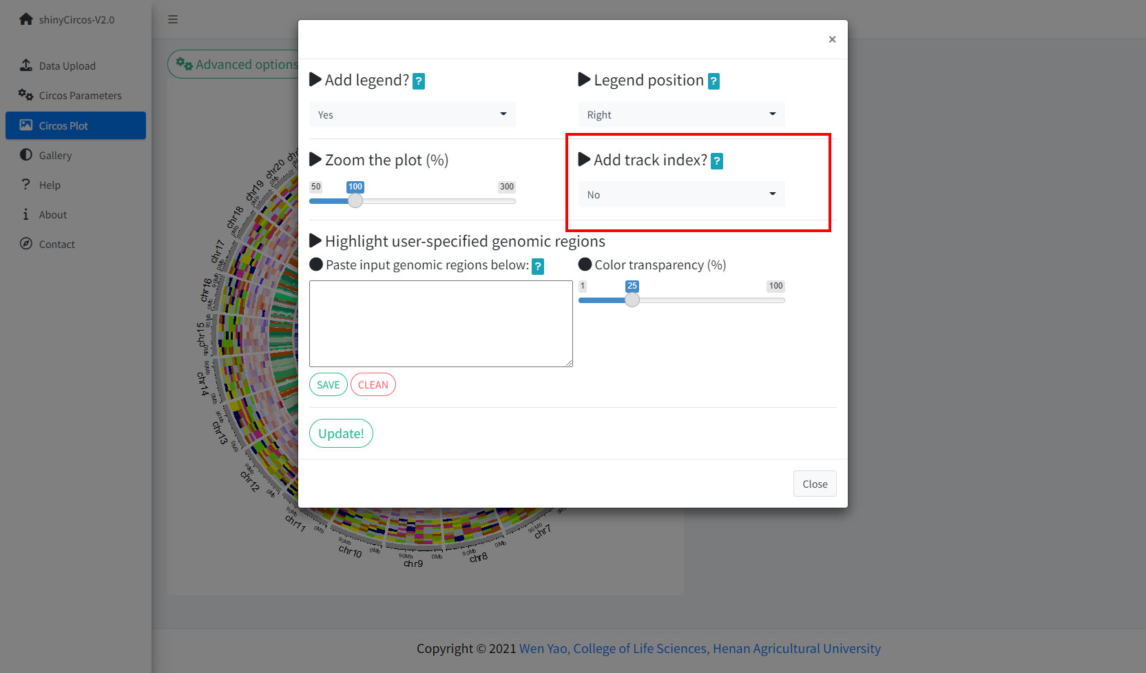
Options to add Track index.
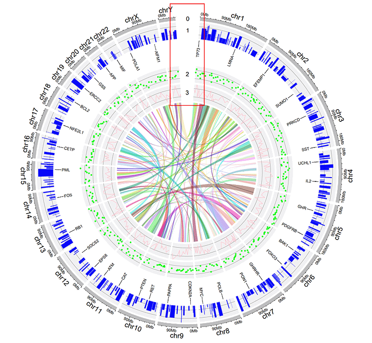
A Circos diagram with Track index.
Video tutorials
| Example Circos plot 1 | On YouTube | On NetEase Video | On venyao.xyz |
| Example Circos plot 2 | On YouTube | On NetEase Video | On venyao.xyz |
| Example Circos plot 3 | On YouTube | On NetEase Video | On venyao.xyz |
| Example Circos plot 4 | On YouTube | On NetEase Video | On venyao.xyz |
| Example Circos plot 5 | On YouTube | On NetEase Video | On venyao.xyz |
| Example Circos plot 6 | On YouTube | On NetEase Video | On venyao.xyz |
| Example Circos plot 7 | On YouTube | On NetEase Video | On venyao.xyz |
| Example Circos plot 8 | On YouTube | On NetEase Video | On venyao.xyz |
| Example Circos plot 9 | On YouTube | On NetEase Video | On venyao.xyz |
| Example Circos plot 10 | On YouTube | On NetEase Video | On venyao.xyz |
简介
shinyCircos-V2.0是一个使用R/Shiny开发的可交互式创建Circos图的web应用程序。
源代码:https://github.com/YaoLab-Bioinfo/shinyCircos-V2.0
在线使用:https://venyao.xyz/shinyCircos/
联系方式:gentelmanwang@gmail.com or yaowen@henau.edu.cnshinyCircos 是由 Yu等人于 2017 年开发的用于绘制 Circos 图的网络工具,其交互界面和易用性得到了许多用户的认可。 shinyCircos-V2.0 是shinyCircos的升级版本。 在shinyCircos-V2.0 中,我们开发了一些高级功能,设计了全新的用户界面,并修复了在shinyCircos 中检测到的bug。
在使用shinyCircos-V2.0之前,我们需要了解一个典型的Circos图的结构。请您仔细阅读并熟悉图像各部分的名字,这样有助于您继续阅读并理解本帮助手册。
一个典型的Circos图的基本结构
一个典型的Circos图的不同"Track"
输入数据格式
要使用 shinyCircos-V2.0,必须以正确的格式准备输入数据。
我们建议以".csv"格式上传输入文件,因为".csv"文件具有明确的格式,常用于数据存储和分析。shinyCircos-V2.0的所有输入数据前三列的顺序都是固定的,分别为chr(染色体)、start(基因组区间的起始位置)、end(基因组区间的终止位置)。
1 染色体数据(用于定义 Circos 图的染色体)
染色体数据是绘图时必不可少的输入数据,它定义了Circos图的染色体。 shinyCircos-V2.0接受两种类型的染色体数据,分别是General chromosome data和Cytoband chromosome data。
1.1 包含3列数据的General chromosome data
General chromosome data包含顺序固定的三列数据,分别是chr(染色体)、start(基因组区间的起始位置)、end(基因组区间的终止位置)。列名不是必需的,任何R语言中合法的列名都可以。但我们建议您使用规范的列名,参考示例数据中的列名。如下图所示:
| chr | start | end |
|---|---|---|
| chr1 | 1 | 249250621 |
| chr2 | 1 | 243199373 |
| chr3 | 1 | 198022430 |
| chr4 | 1 | 191154276 |
| chr5 | 1 | 180915260 |
| chr6 | 1 | 171115067 |
使用General chromosome data创建的Circos图的染色体条带的默认颜色为灰色。
一个使用General chromosome data绘制的Circos图
1.2 包含5列数据的Cytoband chromosome data
Cytoband chromosome data包含顺序固定的五列数据,分别是chr(染色体)、start(基因组区间的起始位置)、end(基因组区间的终止位置)、细胞遗传学带的名称和 Giemsa 染色结果。列名不是必需的,任何R语言中合法的列名都可以。但我们建议您使用规范的列名,参考示例数据中的列名。如下图所示:
| chr | start | end | value1 | value2 |
|---|---|---|---|---|
| chr1 | 1 | 2300000 | p36.33 | geng |
| chr1 | 2300000 | 5400000 | p36.32 | gpos25 |
| chr2 | 1 | 4400000 | p25.3 | geng |
| chr2 | 4400000 | 7100000 | p25.2 | gpos50 |
| chr3 | 1 | 2800000 | p26.3 | gpos50 |
| chr3 | 2800000 | 4000000 | p26.2 | geng |
当用户使用Cytoband chromosome data时,将创建一个带有 Ideogram 染色体的 Circos 图。
一个使用Cytoband chromosome data创建的 Circos 图
2 Track data(用于展示在 Circos 图不同"Track"中的数据)
用户可以上传一个或多个输入数据集并展示在 Circos 图的不同Track中。不同类型的数据集可用于创建不同类型的图形。所有Track data的前三列的顺序是固定的,分别是chr(染色体)、start(基因组区间的起始位置)、end(基因组区间的终止位置)。
2.1 用于绘制bar plot的Track data
用来绘制柱状图的数据应该至少包含四列数据,分别是chr(染色体)、start(基因组区间的起始位置)、end(基因组区间的终止位置)和表示数据值的第四列。第四列的值必须是数字。前4列的列名不是必需的,任何R语言中合法的列名都可以。
shinyCircos-V2.0可用于绘制两种不同的柱状图,分别是Unidirectional柱状图和Bidirectional柱状图。
| chr | start | end | value |
|---|---|---|---|
| chr1 | 10382554 | 26901963 | 0.374 |
| chr1 | 26901963 | 30511288 | 0.084 |
| chr2 | 2129395 | 9774923 | 0.237 |
| chr2 | 14718126 | 15320740 | 0.529 |
| chr3 | 472933 | 7160480 | 0.477 |
| chr3 | 10972902 | 11789212 | 0.636 |
对于Unidirectional柱状图,第四列的最小值将被用作所有柱状图的起点,如下图所示。默认情况下,所有柱子的颜色由shinyCircos随机分配。
一个包含Unidirectional柱状图的Circos图
对于Unidirectional柱状图,还可以在输入数据中添加一个额外的“color”列,用来在 shinyCircos-V2.0 中设置不同柱子的颜色。 “color”列的名称必须明确地指定为“color”。
要为包含多个分组的数据指定颜色,应将包含分组信息的第5列命名为“color”。 用户还需要提供一个字符串来指定每个组的颜色, 例如'a:red;b:green;c:blue',其中'a b c'代表不同的数据组。 没有分配颜色的数据组的颜色将被设置为“grey”。
| chr | start | end | value | color |
|---|---|---|---|---|
| chr1 | 2321390 | 22775301 | -0.525358698 | a |
| chr1 | 43812694 | 44287183 | 0.101162224 | a |
| chr4 | 58783476 | 66246991 | -0.866641798 | a |
| chr4 | 77375595 | 79033629 | -0.313168927 | b |
| chr9 | 5488989 | 10117165 | -0.309662277 | c |
| chr9 | 14069596 | 45956401 | 0.111702254 | c |
一个包含不同颜色柱状图的Circos图
对于双向柱状图,包含数据值的第4列将根据边界值被分为两组。默认边界值为零,可由用户修改。
| chr | start | end | value |
|---|---|---|---|
| chr1 | 5622039 | 9110831 | 0.095 |
| chr1 | 5622039 | 9110831 | -0.405 |
| chr2 | 13669568 | 16275459 | 0.936 |
| chr2 | 13669568 | 16275459 | -0.436 |
| chr3 | 4777699 | 8367346 | 0.174 |
| chr3 | 4777699 | 8367346 | -0.326 |
一个包含Bidirectional柱状图的Circos图
2.2 用于绘制line的Track data
绘制折线图的输入数据应至少包含四列,并按固定顺序排列。第一列定义了多个基因组区域的染色体。第二和第三列定义了这些基因组区域的start和end坐标。 第四列是所有基因组区域的数据值。第四列必须是数字。前4列的列名不是必需的,任何R语言中合法的列名都可以。 默认情况下,所有线条的颜色由shinyCircos随机分配。
| chr | start | end | value |
|---|---|---|---|
| chr1 | 788538 | 5571920 | 0.309 |
| chr1 | 6704086 | 10962288 | -0.075 |
| chr2 | 5331353 | 17190915 | 0.129 |
| chr2 | 27214061 | 37578483 | -0.796 |
| chr3 | 1424915 | 5127305 | -0.413 |
| chr3 | 10792280 | 11980906 | -0.096 |
一个包含折线图的Circos图
此外,用户可以在输入数据中添加一个额外的“color”列,用于给同一Track中不同组的折线加上不同的颜色。“color”列的名称必须明确指定为“color”。
| chr | start | end | value | color |
|---|---|---|---|---|
| chr1 | 2306857 | 8605927 | -0.207 | a |
| chr1 | 20851761 | 21889246 | 0.121 | a |
| chr4 | 97627526 | 102877458 | 0.259 | a |
| chr4 | 106904642 | 109386825 | -0.65 | b |
| chr14 | 84253948 | 92430157 | 0.396 | c |
| chr14 | 97757077 | 100917700 | -0.366 | c |
包含不同颜色折线图的Circos图
通过在输入数据中添加多列数据值,可以在同一Track上绘制多条折线。 对于这种类型的输入数据,所有列的列名都不是必需的,任何R语言中合法的列名都可以。从第四列开始的每一列都必须是数字。
| chr | start | end | value1 | value2 |
|---|---|---|---|---|
| chr1 | 294540 | 4666160 | -0.66 | -0.596 |
| chr1 | 17589118 | 18065224 | -0.138 | -0.747 |
| chr2 | 6872874 | 16224260 | -0.77 | -0.403 |
| chr2 | 24936258 | 28070400 | 0.716 | 0.22 |
| chr3 | 503979 | 24719267 | 0.217 | -0.459 |
| chr3 | 24979219 | 43289811 | 0.226 | -0.185 |
包含多条折线图的Circos图
2.3 用于绘制point的Track data
用于绘制散点图的输入数据和用于绘制折线图的输入数据格式类似。
用于绘制散点图的输入数据应至少包含四列,并按固定顺序排列。第一列定义了多个基因组区域的染色体。第二和第三列定义了这些基因组区域的 start 和 end 坐标。第四列是所有基因组区域的数据值。 请注意,第四列必须是数字。前4列的名字不是必需的,可以是 R 中任何合法的名字。默认情况下,所有点的颜色由 shinyCircos 随机分配。
| chr | start | end | value |
|---|---|---|---|
| chr1 | 1769292 | 1796134 | 0.339 |
| chr1 | 4881594 | 5495466 | 1.005 |
| chr2 | 5800619 | 8815540 | 0.088 |
| chr2 | 10440452 | 10893876 | -0.891 |
| chr3 | 41265 | 7536287 | -0.1 |
| chr3 | 9209200 | 12874260 | -0.032 |
一个包含散点图的Circos图
用户还可以在输入数据中添加一个额外的“cex”列来控制点的大小。“cex”列应该是正数。“cex”列的名称必须明确指定为“cex”。
| chr | start | end | value | cex |
|---|---|---|---|---|
| chr1 | 1326341 | 1845331 | -0.374 | 0.5 |
| chr1 | 9901462 | 15656953 | -0.321 | 0.3 |
| chr2 | 17619104 | 25624262 | -0.194 | 0.6 |
| chr2 | 26946941 | 27889388 | 0.27 | 0.6 |
| chr3 | 1720430 | 4389146 | -0.319 | 0.6 |
| chr3 | 6104592 | 7216808 | 0.315 | 0.6 |
具有不同大小的点的散点图
类似地,用户还可以在输入数据中添加一个额外的“color”列,用来控制同一轨道上不同点的颜色。“color”列的名称必须明确指定为“color”。
| chr | start | end | value | color |
|---|---|---|---|---|
| chr1 | 42002814 | 45209039 | -0.253 | a |
| chr4 | 92963013 | 96656317 | -0.148 | a |
| chr9 | 8290596 | 22658143 | -0.598 | c |
| chr9 | 24382136 | 34055254 | 0.279 | c |
| chrY | 30359053 | 32853733 | -0.286 | d |
| chrY | 34769699 | 39644200 | 0.343 | d |
具有不同颜色的点的散点图
此外,用户还可以在输入数据中添加一个额外的“pch”列,以控制同一轨道上不同点的形状。“pch”列的名称必须明确指定为“pch”(pch的不同取值情况如下图)。
R中pch参数定义的不同点的形状
(图片来源:http://coleoguy.blogspot.com/2016/06/symbols-and-colors-in-r-pch-argument.html)
| chr | start | end | value | pch |
|---|---|---|---|---|
| chr1 | 8605110 | 17214753 | 0.208 | 1 |
| chr3 | 121395059 | 124720880 | 0.269 | 1 |
| chr7 | 46299973 | 47301871 | 0.019 | 13 |
| chr7 | 59003737 | 65956990 | -0.403 | 13 |
| chr11 | 128515663 | 132431158 | 0.146 | 16 |
| chr12 | 7434839 | 18272884 | 0.766 | 16 |
具有不同形状的点的散点图
“cex”、“color”和“pch”列可以同时出现在单个输入数据中。
| chr | start | end | value | pch | cex |
|---|---|---|---|---|---|
| chr1 | 4049230 | 11358879 | -0.59 | 10 | 0.4 |
| chr1 | 18671867 | 29619034 | 0.442 | 10 | 0.7 |
| chr4 | 101737149 | 102799485 | -0.025 | 17 | 0.9 |
| chr7 | 9065662 | 15775923 | 0.174 | 17 | 0.2 |
| chr9 | 32282995 | 33499747 | 0.476 | 18 | 0.7 |
| chr9 | 54414502 | 54804733 | 0.396 | 18 | 0.4 |
具有不同大小和不同形状的点的散点图
| chr | start | end | value | color | cex |
|---|---|---|---|---|---|
| chr1 | 8900700 | 9211013 | -0.6 | a | 0.3 |
| chr1 | 38733680 | 54945292 | 0.233 | a | 1.1 |
| chr5 | 25650709 | 32392960 | 0.409 | b | 0.3 |
| chr5 | 33011156 | 54462250 | -0.245 | b | 1.1 |
| chr7 | 86777790 | 89385025 | 0.006 | b | 0.9 |
| chr7 | 103848396 | 107618696 | -1.093 | b | 1 |
具有不同颜色和不同大小的点的散点图
| chr | start | end | value | color | pch |
|---|---|---|---|---|---|
| chr1 | 3768320 | 4851773 | -0.416 | a | 15 |
| chr1 | 5712552 | 10112216 | -0.41 | a | 15 |
| chr10 | 5831619 | 10981299 | 0.299 | b | 15 |
| chr10 | 13728053 | 15927681 | 0.025 | b | 15 |
| chr22 | 22254151 | 36401489 | 0.182 | c | 17 |
| chr22 | 40556634 | 47770670 | -0.011 | c | 17 |
具有不同颜色和不同类型的点的散点图
| chr | start | end | value | color | pch | cex |
|---|---|---|---|---|---|---|
| chr1 | 14053524 | 24878326 | -0.498 | a | 1 | 0.9 |
| chr1 | 29640089 | 49313488 | -0.565 | a | 1 | 1 |
| chr4 | 8408012 | 12767180 | -0.108 | b | 4 | 0.4 |
| chr4 | 22963697 | 41682972 | -0.45 | b | 4 | 0.9 |
| chr9 | 51441395 | 53095312 | 0.527 | c | 6 | 1.1 |
| chr9 | 65510881 | 69698456 | 0.127 | c | 6 | 1.1 |
同时带有“color”、“pch”和“cex”列的散点图输入数据
同时具有不同颜色、不同类型和不同大小的点的散点图
同样,我们也可以通过在输入数据中加入多列数据值来绘制多组点图。对于这种类型的输入数据,所有列的名字都不是必需的,可以是 R 中任何合法的名字。从第四列开始的每一列都必须是数字。
| chr | start | end | value1 | value2 |
|---|---|---|---|---|
| chr1 | 7224218 | 16393864 | -0.196 | -0.955 |
| chr1 | 21093451 | 25392112 | 0.128 | 0.275 |
| chr3 | 14909280 | 22502495 | 0.421 | -0.185 |
| chr3 | 24704666 | 26117987 | -0.102 | 0.637 |
| chr4 | 35556750 | 37025119 | 0.063 | 0.848 |
| chr4 | 39947625 | 63436481 | 0.28 | -0.262 |
包含多组散点图的Circos图
2.4 用于绘制ideogram的Track data
ideogram是染色体的图形表示。 在shinyCircos-V2.0中,我们可以在任何Track上绘制ideogram。 用于创建ideogram的输入数据格式与Cytoband chromosome data的格式相同。
| chr | start | end | value1 | value2 |
|---|---|---|---|---|
| chr1 | 1 | 2300000 | p36.33 | gneg |
| chr1 | 2300000 | 5400000 | p36.32 | gpos25 |
| chr2 | 1 | 4400000 | p25.3 | gneg |
| chr2 | 4400000 | 7100000 | p25.2 | gpos50 |
| chr3 | 1 | 2800000 | p26.3 | gpos50 |
| chr3 | 2800000 | 4000000 | p26.2 | gneg |
一个包含单个ideogram轨道的Circos图
2.5 用于绘制rect-discrete的Track data
用于绘制rect-discrete的输入数据应仅包含顺序固定的四列。第一列定义了多个基因组区域的染色体。第二和第三列定义了这些基因组区域的 start 和 end 坐标。第四列必须是字符向量。所有四列的名称都不是必需的,任何R语言中合法的列名都可以。
| chr | start | end | group |
|---|---|---|---|
| chr1 | 1465 | 5857186 | b |
| chr1 | 6005405 | 7051583 | c |
| chr3 | 13 | 3831804 | d |
| chr3 | 3989861 | 11612588 | g |
| chr5 | 56 | 2698252 | h |
| chr5 | 2719598 | 9370038 | c |
一个包含rect-discrete的Circos图
2.6 用于绘制rect-gradual的Track data
用于绘制rect-gradual的输入数据应仅包含顺序固定的四列。第一列定义了多个基因组区域的染色体。第二和第三列定义了这些基因组区域的start和end坐标。第四列是所有基因组区域的数据值。第四列必须是数字。所有四列的名称都不是必需的,任何R语言中合法的列名都可以。
| chr | start | end | value |
|---|---|---|---|
| chr1 | 1 | 6657591 | 0.034 |
| chr1 | 9792529 | 20706145 | -0.527 |
| chr3 | 651 | 27839332 | -0.532 |
| chr3 | 28591880 | 29683518 | -0.156 |
| chr5 | 407 | 16490429 | 0.281 |
| chr5 | 17056645 | 32303717 | 0.485 |
一个包含rect-gradual的Circos图
2.7 用于绘制heatmap-discrete的Track data
用于绘制离散型热图的输入数据应包含≥4列。第一列定义了多个基因组区域的染色体。第二和第三列定义了这些基因组区域的start和end 坐标。其余的每一列都应该是一个字符向量。所有列的列名都不是必需的,任何R语言中合法的列名都可以。
| chr | start | end | group1 | group2 | group3 | group4 | group5 | group6 | group7 | group8 | group9 | group10 |
|---|---|---|---|---|---|---|---|---|---|---|---|---|
| chr1 | 20621957 | 21209624 | d | a | a | e | e | c | d | g | g | d |
| chr1 | 42967726 | 53028972 | f | b | h | b | g | c | b | h | h | d |
| chr3 | 17138030 | 40796035 | f | h | c | f | a | a | g | h | h | h |
| chr3 | 57219142 | 60650338 | g | b | g | f | b | g | f | f | b | e |
| chr5 | 8910650 | 10080670 | f | c | e | c | b | e | h | b | a | g |
| chr5 | 13535538 | 32715550 | h | h | h | e | d | c | e | b | h | c |
一个包含离散型热图的Circos图
2.8 用于绘制heatmap-gradual的Track data
用于绘制连续型热图的输入数据应包含≥4列。第一列定义了多个基因组区域的染色体。第二和第三列定义了这些基因组区域的start和end坐标。其余的每一列都应该是一个数字向量。所有列的列名都不是必需的,任何R语言中合法的列名都可以。
| chr | start | end | value1 | value2 | value3 | value4 | value5 | value6 | value7 | value8 | value9 | value10 |
|---|---|---|---|---|---|---|---|---|---|---|---|---|
| chr1 | 20621957 | 21209624 | -0.672 | -0.271 | -0.001 | 0.486 | -0.986 | -0.37 | 0.48 | 0.38 | 0.158 | 0.108 |
| chr1 | 42967726 | 53028972 | -0.147 | 0.387 | 1.332 | 0.182 | 0.16 | -0.132 | 0.234 | -0.089 | -0.918 | 0.397 |
| chr3 | 17138030 | 40796035 | 0.046 | 0.028 | -0.691 | -0.341 | 1.011 | -0.242 | -0.027 | -0.273 | 0.276 | -1.028 |
| chr3 | 57219142 | 60650338 | -0.514 | 0.429 | 0.29 | -0.356 | -0.025 | 0.537 | -0.368 | 0.486 | 0.392 | -0.085 |
| chr5 | 8910650 | 10080670 | 0.175 | -0.855 | 0.934 | -0.914 | 0.879 | -0.181 | -0.512 | -0.074 | 0.302 | 0.04 |
| chr5 | 13535538 | 32715550 | 0.088 | 0.005 | 1.005 | -0.076 | -0.007 | 0.371 | 0.494 | -0.236 | 0.219 | -0.422 |
一个包含连续型热图的Circos图
2.9 用于绘制stack-point的Track data
使用shinyCircos-V2.0,我们还可以创建堆栈点图表(stack point)。输入数据应仅包含顺序固定的四列。第一列定义了多个基因组区域的染色体。第二和第三列定义了这些基因组区域的start和end坐标。第四列包含不同分组的数据值。同一组的数据值将绘制在同一行上。所有列的列名都不是必需的,可以是R语言中任何合法的列名。
| chr | start | end | stack |
|---|---|---|---|
| chr1 | 11589909 | 40133642 | a |
| chr1 | 52614734 | 59580026 | a |
| chr5 | 28358375 | 28943627 | a |
| chr5 | 48623024 | 64086871 | a |
| chr1 | 37080716 | 41662004 | b |
| chr1 | 87453098 | 89776607 | b |
一个包含堆叠的点的单个轨道的Circos图
3 Label data(用于标记Track data中的元素)
label data主要用于注释指定轨道中的元素。输入数据应包含四列或五列,如下表所示。
包含四列数据的label data用于绘制单一颜色的label。默认情况下,使用的颜色是黑色,用户可以使用shinyCircos中的功能模块指定颜色。所有四列的列名都不是必需的,任何R语言中合法的列名都可以。
| chr | start | end | label |
|---|---|---|---|
| chr1 | 3698046 | 3736201 | TP73 |
| chr1 | 156114670 | 156140089 | LMNA |
| chr5 | 42423775 | 42721878 | GHR |
| chr5 | 150113839 | 150155859 | PDGFRB |
| chr9 | 116153792 | 116402321 | PAPPA |
| chr9 | 21967752 | 21975133 | CDKN2A |
一个包含文本label的 Circos 图
包含五列数据的label data可以用于绘制不同颜色的label,用户需要提供一个额外的列,其值为颜色值。这种情况下,列名不是必需的,所有5列的列名可以是R语言中任何合法的列名。第五列的值必须是有效的颜色名字。
| chr | start | end | label | color |
|---|---|---|---|---|
| chr1 | 3698046 | 3736201 | TP73 | red |
| chr1 | 156114670 | 156140089 | LMNA | #FF000080 |
| chr5 | 42423775 | 42721878 | GHR | blue |
| chr5 | 150113839 | 150155859 | PDGFRB | #00FF00 |
| chr9 | 116153792 | 116402321 | PAPPA | blue |
| chr9 | 21967752 | 21975133 | CDKN2A | green |
带有不同颜色label的一个示例Circos图
4 Links data
用于绘制Links的输入数据应包含六列或者七列。前三列定义了染色体、多个基因组区域的开始和结束坐标。输入数据的第4-6列定义了另一组基因组区域的染色体、开始和结束坐标。shinyCircos将在输入数据的同一行中的两个基因组区域之间创建link。默认情况下,所有link的颜色由shinyCircos随机分配。
对于包含6列的links输入数据,列名不是必需的,任何R语言中合法的列名都可以。
对于包含7列的links输入数据,列名是必需的。前6列的列名可以是R语言中任何合法的列名。第7列的列名必须明确指定为“color”。
| chr1 | start1 | end1 | chr2 | start2 | end2 |
|---|---|---|---|---|---|
| chr20 | 37720821 | 47419255 | chr5 | 162124929 | 168434522 |
| chr8 | 76179361 | 83302661 | chr1 | 162049212 | 213797379 |
| chr2 | 38375277 | 49805216 | chr11 | 19060895 | 36294068 |
| chr2 | 120255288 | 134792772 | chr13 | 62362083 | 71502856 |
| chr4 | 95199225 | 102508113 | chr13 | 16327889 | 24910342 |
| chr15 | 83769167 | 83992136 | chr10 | 83790329 | 119443216 |
一个包含links的Circos图
对于包含7列的links输入数据,第7列“color”列可以是字符向量或数值向量。
| chr1 | start1 | end1 | chr2 | start2 | end2 | color |
|---|---|---|---|---|---|---|
| chr20 | 37720821 | 47419255 | chr5 | 162124929 | 168434522 | c |
| chr8 | 76179361 | 83302661 | chr1 | 162049212 | 213797379 | c |
| chr2 | 38375277 | 49805216 | chr11 | 19060895 | 36294068 | b |
| chr2 | 120255288 | 134792772 | chr13 | 62362083 | 71502856 | a |
| chr4 | 95199225 | 102508113 | chr13 | 16327889 | 24910342 | a |
| chr15 | 83769167 | 83992136 | chr10 | 83790329 | 119443216 | b |
一个包含不同颜色links的Circos图,links的颜色由分组决定
| chr1 | start1 | end1 | chr2 | start2 | end2 | color |
|---|---|---|---|---|---|---|
| chr20 | 37720821 | 47419255 | chr5 | 162124929 | 168434522 | 217 |
| chr8 | 76179361 | 83302661 | chr1 | 162049212 | 213797379 | 7 |
| chr2 | 38375277 | 49805216 | chr11 | 19060895 | 36294068 | 206 |
| chr2 | 120255288 | 134792772 | chr13 | 62362083 | 71502856 | 27 |
| chr4 | 95199225 | 102508113 | chr13 | 16327889 | 24910342 | 189 |
| chr15 | 83769167 | 83992136 | chr10 | 83790329 | 119443216 | 161 |
一个带有渐变颜色links的示例 Circos 图
目录
输入数据格式
1 染色体数据(用于定义 Circos 图的染色体)
1.1 包含3列数据的General chromosome data
1.2 包含5列数据的Cytoband chromosome data
2 Track data(展示在 Circos 图不同"Track"中的数据)
2.1 用于绘制bar plot的Track data
2.2 用于绘制line的Track data
2.3 用于绘制point的Track data
2.4 用于绘制ideogram的Track data
2.5 用于绘制rect-discrete的Track data
2.6 用于绘制rect-gradual的Track data
2.7 用于绘制heatmap-discrete的Track data
2.8 用于绘制heatmap-gradual的Track data
2.9 用于绘制stack-point的Track data
2.10 用于绘制stack-line的Track data
3 Label data(用于标记Track data中的元素)
4 Links data
在线或在本地计算机上使用shinyCircos
1 在线使用shinyCircos-V2.0
在线使用shinyCircos-V2.0的网址是https://venyao.xyz/shinyCircos/。
2 shinyCircos-V2.0的用户界面
shinyCircos-V2.0应用程序包含8个主菜单:“shinyCircos-V2.0”,“Data Upload”,“Circos Parameters”,“Circos Plot”,“Gallery”,“Help”,“About”和“Contact”(见下图)。“shinyCircos-V2.0”菜单列出了Circos图的基本介绍。
shinyCircos-V2.0的主页面
“Data Upload”菜单允许用户上传输入数据或是载入示例数据(如下图)。
“Data Upload”界面
您可以同时上传多个数据,也可以分别上传。每次上传输入数据后,请将上传的数据从“Candidate area”拖到“Chromosome data”或“Track data”或“Label data”或“Links data”框中,然后点击“Save uploaded data”按钮保存数据。然后,您可以继续上传数据或点击“Submit the uploaded datasets”提交数据。
从本地磁盘上传输入数据
用户还可以选择加载存储在shinyCircos中的示例数据集。shinyCircos中总共存储了10个不同的示例数据集。
从 shinyCircos 加载示例数据
“Circos Parameters”界面为用户提供了查看所有上传数据集内容的功能,以及为每个输入数据集设置参数的功能。输入数据集被归为四组,分别是Chromosome data、Track data、Label data和Links data。每个输入数据集的文件名显示在此页面的某一行中。用户可以通过点击相应文件名旁边的眼睛图标来查看每个数据集的内容。对于每个输入数据集,用户需要设置绘图类型和其他绘图参数。每行末尾设计了一个小齿轮,供用户设置绘图参数。
shinyCircos-V2.0的“Circos Parameters”界面
将所有输入数据集和参数提交到shinyCircos服务器后,shinyCircos-V2.0将绘制一个Circos图并展示在“Circos Plot”页面中。绘制的Circos图可以下载为PDF或SVG格式的文件。在“Advanced options”按钮中有一些用于调整所绘制的Circos图外观的高级参数。
shinyCircos-V2.0的“Circos Plot”界面
“Gallery”界面展示了使用shinyCircos-V2.0创建的30个示例Circos图。用于创建每个示例Circos图的输入数据也提供了下载链接。前十个示例Circos的输入数据和“Data Upload”界面提供的example data是一样的。
shinyCircos-V2.0的“Gallery”界面
“Help”界面提供了shinyCircos-V2.0的帮助手册。
shinyCircos-V2.0的“Help”界面
shinyCircos-V2.0使用的R包等信息展示在“About”页面中。
shinyCircos-V2.0的“About”界面
“Contact”页面列出了一些联系信息。
shinyCircos-V2.0的“Contact”界面
3 在个人电脑上安装使用shinyCircos-V2.0
用户也可以选择在个人电脑(Windows、Mac或Linux)上安装和运行shinyCircos-V2.0,而无需将数据上传到在线服务器。shinyCircos-V2.0是跨平台的应用,即shinyCircos-V2.0可以安装在任何具有可用R环境的平台上。shinyCircos-V2.0的安装包括三个步骤。
步骤1:安装R和RStudio
请查看CRAN (https://cran.r-project.org/)以了解R的安装过程。请查看(https://www.rstudio.com/)以了解RStudio的安装过程。
步骤2:安装R/Shiny包和shinyCircos-V2.0需要的其他R包
打开RStudio启动一个R会话并运行以下代码行 :
        # try an http CRAN mirror if https CRAN mirror doesn't work
        install.packages("shiny")
        install.packages("circlize")
        install.packages("bs4Dash")
        install.packages("DT")
        install.packages("RColorBrewer")
        install.packages("shinyWidgets")
        install.packages("data.table")
        install.packages("shinyBS")
        install.packages("sortable")
        install.packages("shinyjqui")
        install.packages("shinycssloaders")
        install.packages("colourpicker")
        install.packages("gridBase")
        install.packages("randomcoloR")
        install.packages("gtools")
        install.packages("BiocManager")
        BiocManager::install("ComplexHeatmap")
确保以上包都正确地安装在R中。
步骤3:运行shinyCircos-V2.0应用程序
使用RStudio启动R会话并运行以下代码行:
shiny::runGitHub("shinyCircos-V2.0", "YaoLab-Bioinfo")此命令将从GitHub下载shinyCircos-V2.0的源代码到您计算机的临时目录中,然后在web浏览器中启动shinyCircos-V2.0应用程序。一旦网页浏览器关闭,下载的shinyCircos-V2.0代码将从您的电脑中删除。下次在RStudio中运行这个命令时,它将再次从GitHub下载shinyCircos-V2.0的源代码到一个临时目录。这个过程十分麻烦,因为从GitHub下载shinyCircos-V2.0的代码需要一些时间。
建议用户将shinyCircos-V2.0的源代码从GitHub下载到您电脑的一个固定目录,如Windows上的“E:\apps”,按照下图所示的步骤,一个名为“shinyCircos-V2.0-master.zip”的zip文件将下载到您的计算机中。将此文件移动到“E:\apps”并解压缩此文件。然后在“E:\apps”中会生成一个名为“shinyCircos-V2.0-master”的目录。脚本“server.R”和“ui.R”可以在“E:\apps\ shinyCircos-V2.0-master”中找到。然后,您可以通过在RStudio中运行以下几行脚本来启动shinyCircos-V2.0应用程序。
从GitHub下载源代码
        library(shiny)
        runApp("E:/apps/shinyCircos-V2.0-master", launch.browser = TRUE)
然后,shinyCircos-V2.0应用程序将在计算机的默认网页浏览器中打开。
利用shinyCircos-V2.0绘制Circos图的步骤
要使用shinyCircos-V2.0制作 Circos 图,用户必须准备并上传定义特定基因组染色体信息的文件,以及要沿基因组展示的其他输入数据。在本节中,我们将演示使用示例数据集创建Circos图的所有基本步骤。
1 利用shinyCircos-V2.0绘制Circos图的基本步骤
步骤1:准备并上传定义基因组长度的“Chromosome data”
染色体数据对于shinyCircos-V2.0是必不可少的,因为它定义了Circos图的染色体。染色体数据的详细格式在输入数据格式部分中有描述。
使用 shinyCircos-V2.0 的“Data Upload”菜单中上传数据的功能模块,将名为“chromosome_general.csv”的文件从本地磁盘上传到shinyCircos-V2.0,如下图所示。
上传染色体数据
步骤2:上传一个或多个输入数据集以展示在不同的Tracks中
除了染色体数据,用户还可以上传一个或多个其它类型的输入数据,以展示在Circos图的不同Tracks中。制作不同类型图形的输入文件的详细格式在“2 输入数据格式”部分有详细说明。 现在我们将两个名为“barplot.csv”和“line.csv”的文件从本地磁盘上传到 shinyCircos-V2.0中。两个数据集都需要分发到“Track data”框中。记得及时保存上传的数据。
步骤3:为每个输入数据集设置“Track index”和绘图类型
默认情况下,输入数据集的Track index由其上传顺序决定。所有输入数据集的默认绘图类型都是“point”。在这里,我们需要将“barplot.csv”的绘图类型设置为“bar”,并将“line.csv”的绘图类型设置为“line”。
在shinyCircos-V2.0的“Circos Parameters”页面设置Track index和plot type。
步骤4:点击“Submit!”按钮绘制图形
当所有输入数据集成功上传到shinyCircos-V2.0,并设置了正确track index和绘图类型后,我们需要单击“Circos Parameters” 菜单底部的“Step 4. Submit the plot parameters to make the Circos plot!”按钮,开始绘制Circos图形。 默认情况下,在绘制图形时,shinyCircos-V2.0将使用随机颜色或者预定义的颜色。
4.2 通过替换一个或多个输入数据集来更新 Circos 图
Circos图的一个Track常由单个输入数据定义。典型的Circos图通常包含由多个输入数据定义的多个轨道。在绘制出一个Circos图的时候,用户可能想要替换这些输入文件中的一个或多个,从而更新Circos图的某些Track,而无需重新创建整个Circos图。
例如,我们想通过将 Track2 的“line.csv”替换为新的输入文件“rect_discrete.csv”来创建包含离散矩形的Circos图。
为此,我们可以跳转到“Data Upload”页面,将“rect_discrete.csv”上传并分发到“Track data”框中,然后把“line.csv”文件移动到“Garbage”框。之后,我们需要点击“Step 2.2. Save uploaded data”按钮保存上传的数据。同时,我们需要将新上传的数据的绘图类型从“line”更改为“rect_discrete”。
最后,我们需要点击“Circos Parameters”页面底部的“Step 4. Submit the plot parameters to make the Circos plot!” 按钮以更新Circos图。
3 以PDF或SVG格式下载创建的Circos图形
生成Circos图形后,用户可以使用“Circos Plot”页面上方的“Download PDF-file”和“Download SVG-file”模块下载PDF或SVG格式的Circos图(如下图)。默认情况下,下载的两个文件的名字分别为“shinyCircos.pdf”和“shinyCircos.svg”。 下载的PDF文件“shinyCircos.pdf”可以在Adobe Acrobat中打开,下载的SVG文件“shinyCircos.svg”可以在Google Chrome浏览器中打开。
下载绘制的Circos图形的功能模块
4 利用shinyCircos-V2.0绘制复杂Circos图的基本步骤
使用shinyCircos-V2.0可以创建10种不同类型的图形,包括point, line, bar, stack-line,stack-point,rect-gradual, rect-discrete, heatmap-gradual, heatmap-discrete和ideogram。要创建一个Circos图,至少需要一个输入数据文件,即定义基因组长度的基因组数据文件。
在这一节中,我们将展示绘制复杂Circos图的基本步骤(如下图)。
步骤1:上传所有输入数据并将每个数据分发到适当的数据类型选择框中
上传所有输入数据并将每个输入数据分发到适当的数据类型选择框中
步骤2:为每个输入数据设置绘图类型和Track index
为每个输入数据设置绘图类型和Track index
步骤3:设置所有Track的绘图参数
为绘制柱状图设置参数
步骤4:设置高级参数
“Circos Plot”页面的“Advanced options”按钮
shinyCircos-V2.0 中设计的高级绘图参数
包含Track索引和图例的Circos图
步骤5:高亮一个或多个基因组区域
shinyCircos-V2.0中用于高亮一个或多个基因组区域的功能模块
一定要点击“SAVE”按钮输入需要高亮的基因组区域并检测输入数据格式是否有问题。对于所设置的所有高级参数,需要点击“Update”按钮,使所有设置的高级选项生效。
高亮了一个用户输入的基因组区域的circos图
目录
4 利用shinyCircos-V2.0绘制Circos图
4.1 利用shinyCircos-V2.0绘制Circos图的基本步骤
步骤1:准备并上传定义基因组长度的"chromosome data"
步骤2:上传一个或多个输入数据集以展示在不同的Tracks中
步骤3:为每个输入数据集设置“Track index”和绘图类型
步骤4:点击“Submit!”按钮绘制图形
4.2 通过替换一个或多个输入数据集来更新 Circos 图
4.3 以PDF或SVG格式下载创建的Circos图形
4.4 利用shinyCircos-V2.0绘制复杂Circos图的基本步骤
步骤1:上传所有输入数据并将每个数据分发到适当的数据类型选择框中
步骤2:为每个输入数据设置绘图类型和Track index
步骤3:设置所有Track的绘图参数
步骤4:设置高级参数
步骤5:高亮一个或多个基因组区域
修饰Circos图的绘图选项
“Circos Parameters”页面的每行数据的右侧有一个小齿轮按钮,用户点击后将会弹出一个参数设置的弹出框,可以对很多选项进行个性化设置,比如Track的高度、Track之间的距离、各部分的颜色等等。本节将展示其中一些选项的设置。
1 Track高度
默认Track高度为 0.1。调高这个数字可以增加Track的高度。
调整“Track”高度的功能模块
2 纵坐标轴
shinyCircos-V2.0现在支持给指定的Track添加Y轴,以显示对应Track所有数据的取值范围。
用来添加y坐标轴的功能模块
包含y坐标轴的Circos图
3 不同“Track”之间的间距
该参数用于调整相邻Track之间的距离,也可用于调整Track与label data之间的距离,或者Track与links之间的距离。
不同“Track”之间间距的功能模块
不同track之间间距较大的一个Circos图
4 “Sector”的边框
shinyCircos-V2.0 还支持为一个或多个“Track”中的sector添加边框。
用来添加“Sector”边框的功能模块
“Sector”带有边框的Circos图
5 “Track”的背景颜色
在shinyCircos-V2.0中,用户可以调整不同“Track”的背景颜色,用来区分不同的“Track”。用户可以在弹出窗口中通过“Background color(s)”选项选择或输入适当的颜色来调整“Track”的颜色。
更改“Track”背景颜色的功能模块
一个Circos图,不同的“Track”对应不同的背景颜色
6 不同“Sector”之间的间距
此参数用于调整相邻“Sector”之间的间距大小。用户可以输入任意长度的数值向量,输入的向量会被调整为和“Sector”的数目一致。例如,“1”或“1,2,3,1”。第一个数字对应第一个和第二和Sector之间的间距。
用来设置不同“Sector”之间间距的功能模块
相邻“Sector”之间间距更大的一个Circos图
高级功能
与shinyCircos相比,我们在shinyCircos-V2.0中开发了多个高级功能。
1 添加图例
当用户绘制了“stack-line”、“stack-point”、“heatmap-gradual”、“heatmap-discrete”、“rect-gradual”和“rect-discrete”这六种类型的“Track”时,用户可以使用“Circos Plot”页面中“Advanced options”按钮中的功能来添加图例。图例可以添加在Circos图的底部或右侧(见下图)。
用来给Circos图添加图例的功能模块
一个包含图例的Circos图
2 高亮特定基因组区域
shinyCircos-V2.0支持高亮Circos图中的一个或多个基因组区域。用户可以通过“Circos Plot”页面中的“Advanced options”按钮来使用这个功能。
用来高亮一个或多个基因组区域的功能模块
包含高亮的基因组区域的一个Circos图
3 调整图像大小
shinyCircos-V2.0支持使用如下图所示的功能模块来调整Circos图的大小。
用来调整Circos图大小的功能模块
4 添加“Track index”
shinyCircos-V2.0支持为Circos plot的所有Track添加索引,以区分不同的Track。 用户可以使用“Circos Plot”页面中“Advanced options”按钮中的功能来添加Track index。
用来添加“Track index”的功能模块
包含“Track index”的Circos图
视频教程
| 示例Circos图1 | On YouTube | On NetEase Video | On venyao.xyz |
| 示例Circos图2 | On YouTube | On NetEase Video | On venyao.xyz |
| 示例Circos图3 | On YouTube | On NetEase Video | On venyao.xyz |
| 示例Circos图4 | On YouTube | On NetEase Video | On venyao.xyz |
| 示例Circos图5 | On YouTube | On NetEase Video | On venyao.xyz |
| 示例Circos图6 | On YouTube | On NetEase Video | On venyao.xyz |
| 示例Circos图7 | On YouTube | On NetEase Video | On venyao.xyz |
| 示例Circos图8 | On YouTube | On NetEase Video | On venyao.xyz |
| 示例Circos图9 | On YouTube | On NetEase Video | On venyao.xyz |
| 示例Circos图10 | On YouTube | On NetEase Video | On venyao.xyz |
- Software references
- Further references
- Citation
1. R Development Core Team. R: A Language and Environment for Statistical Computing. R Foundation for Statistical Computing, Vienna (2016)
2. RStudio and Inc. shiny: Web Application Framework for R. R package version 1.0.0 (2016)
3. Gu, Z. circlize: Circular Visualization. R package version 0.4.15 (2017)
4. Neuwirth, E. RColorBrewer: ColorBrewer palettes. R package version 1.1-2 (2014)
5. Dowle, M. data.table: Extension of Data.frame. R package version 1.14.2 (2021)
6. Victor Perrier. shinyWidgets: Extend widgets available in shiny. R package version 0.6.4 (2022)
7. Eric Bailey. shinyBS: Add additional functionality and interactivity to your Shiny applications. R package version 0.61 (2015)
8. RStudio and Inc. DT: An R interface to the DataTables library. R package version 0.22 (2015)
9. Andrie de Vries. sortable: Enables drag-and-drop behaviour in Shiny apps. R package version 0.4.5 (2021)
10. Yang Tang. shinyjqui: easily add interactions and animation effects to a shiny app. R package version 0.4.1 (2022)
11. Dean Attali. colourpicker: A colour picker that can be used as an input in Shiny apps R package version 1.1.1 (2021)
12. Gu, Z. ComplexHeatmap: efficient to visualize associations between different sources of data sets and reveal potential patterns. R package version 2.14.0 (2020)
13. Ron Ammar. randomcoloR: Simple methods to generate attractive random colors. R package version 1.1.0.1 (2019)
14. Dean Attali. shinycssloaders: Add Loading Animations to a 'shiny' Output While It's Recalculating. R package version 1.0.0 (2020)
15. David Granjon. bs4Dash: Make 'Bootstrap 4' Shiny dashboards. R package version 2.2.1 (2022)
16. Paul Murrell. gridBase: Integration of base and grid graphics. R package version 0.4-7 (2014)
This application was created by Wen Yao and Yazhou Wang. Please send bugs and feature requests to Wen Yao (yaowen at henau.edu.cn) or Yazhou Wang (gentelmanwang at gmail.com). This application uses the shiny package from RStudio.
Henan Agricultural University
![]()
Contact us
- If you have any questions or suggestions about shinyCircos, please do not hesitate to contact us.
- E-mail: yaowen@henau.edu.cn or gentelmanwang@gmail.com
- QQ Group: 495027653
- Telegram Group: https://t.me/+NadFeZazBBc2Y2U1